Colour: Selection, Communication & Matching - Part 2
Part 2: Lost in Translation — How to Communicate Brand Colour Across the Supply Chain
In Part 2 of this article, Thomas Polster turns from colour selection to colour communication — exploring the digital tools and standards that can make the difference between a colour that travels well across markets and one that quietly drifts.
What you will learn in this article:
• How digital colour standards can reduce risk, improve consistency, and save time
• The difference between Pantone Master and Dependent libraries — and why it matters for packaging
• How CxF files can support stronger colour consistency across global supply chains
"Let us begin with the selection of a brand colour. Particularly on LinkedIn, I frequently come across statements suggesting that companies should never communicate colours using Pantone codes, or even abandon the Pantone Formula Guide altogether. But is that practical?
I am certainly not a strong advocate of the PMS guide and have experienced its limitations firsthand. However, the reality is that replacing this long-established “communication tool” is not nearly as straightforward as some would suggest.
For the purpose of this discussion, let us assume that, in addition to CMYK, we have selected a spot colour for our packaging design. Our chosen colour is PMS 298 C. The question now becomes:
How do we communicate this colour throughout the production supply chain?
If we rely solely on a visual colour reference, we immediately enter several potential risk areas:
• Which version of the Pantone guide am I using?
• Which version are the other stakeholders in the supply chain using?
• Even within the same Pantone guide edition, colour differences of ΔE 3.0 or greater can occur, which is far from ideal.
• In addition, physical guides are subject to aging and wear.
• Human colour perception can vary considerably due to factors such as stress, fatigue, illness, lighting conditions, alcohol and visual illusions.
Of course, one option would be to send the same physical guide to everyone involved in the process, but realistically, who actually does that?
Fortunately, Pantone offers a digital solution that can help address many of these challenges: PantoneLIVE®, the digital Pantone library. PantoneLIVE® includes the Master Standard Libraries, which are essentially the digital equivalents of the physical Pantone Formula Guides:
• Pantone Solid Coated & Uncoated
• Pantone Pastels & Neons Coated & Uncoated
These digital libraries provide a common reference point and significantly improve colour communication across geographically dispersed supply chains by reducing the ambiguity associated with physical colour guides.
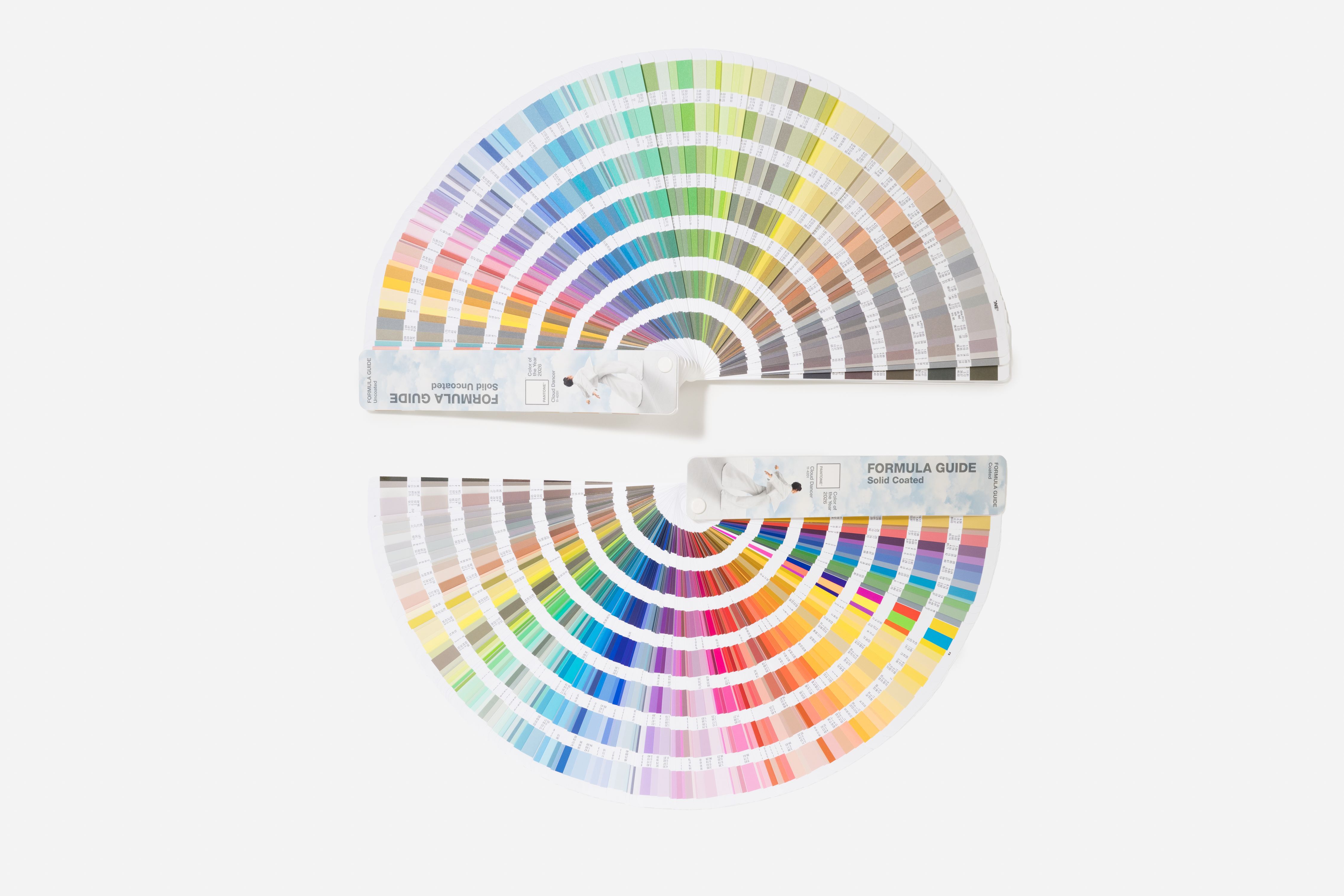
However, these master standard libraries are not ideal for Packaging Printing. For packaging applications, PantoneLIVE® offers the so-called Dependent Libraries.
These are digital versions of the Pantone Solid Coated color palette that have been specifically developed for the packaging industry. They cover a wide range of printing technologies, including:
• Conventional offset printing
• UV offset printing
• Water-based flexographic printing
• Solvent-based flexographic printing
• Gravure printing
• And many other packaging-specific print processes
In total, there are more than 40 different PantoneLIVE® libraries available. For example, PantoneLIVE® provides eight dedicated colour libraries specifically for carton offset printing.
What makes these libraries different?
They are developed using:
• Only suitable pigments for the respective packaging application
• Typical packaging substrates
• Relevant coatings and varnishes
• Optimized ink film thicknesses
As a result, the colour targets are based on realistic packaging production conditions and are therefore far more achievable in practice than the generic Master Standard references.
In other words, the PantoneLIVE® Dependent Libraries are not theoretical colour targets. They are packaging-specific standards that have been engineered to reflect actual printing conditions, enabling more accurate colour communication and more reliable colour matching throughout the packaging supply chain.

Some Examples:
Pantone Library Name - Target Reference Code
Pantone Solid Coated PANTONE - Pantone 298 C
Pantone Solid Uncoated PANTONE - Pantone 298 U
Pantone Carton Offset Recycled Carton Board Matt V - Pantone 298 C LPRM
Pantone Carton Offset Recycled Carton Board V - Pantone 298 C LPEB
Pantone Carton Offset Virgin Carton Board Matt V - Pantone 298 C LPVM
Pantone Carton Offset Virgin Carton Board V - Pantone 298 C LUGB
Dependent Libraries also include brand-specific libraries created for the packaging industry. Access to the brand libraries is available only through a paid license. For some brands, users must obtain access authorization.
Brands known to use PantoneLIVE® include, for example: UNILEVER, P&G, PEPSI, COCA COLA, 3M, Folmex, Costa Coffee, Bud, ABInBev, Walgreens, Kimberly-Clark
Pantone LIVE®Master Standard
- Originally created for the commercial printing market
- Some unsuitable pigments for packaging
- Good quality substrates
- No varnish applied
- High filmweights used
- Some targets unachievable to close spectral match in packaging scenario
- Coding is PANTONE NUMBER C e.g. PANTONE 298 C
Pantone LIVE Dependent
- Created specifically for the printed packaging market
- Suitable pigments
- Typical packaging substrates
- Typical packaging coatings
- Optimum filmweights used
- Achievable targets for packaging scenario
- Coding is P_Pantone Number_C_Dependant Library Reference e.g. P298C LPEB
LET’S BRIEFLY SUMMARIZE:
Relying solely on the physical Pantone colour fan deck to communicate colours carries significant risks. Pantone offers a digital solution for this that we can use: PantoneLIVE®, the digital Pantone colour swatch book
There is more than just one Pantone Digital Library - there is the digital Pantone Solid Coated Master Standard and Pantone Dependent
- The Pantone Solid Coated colour library is not intended for the printed packaging market.
- The Pantone Dependent colour libraries were developed specifically for the printed packaging market.
- Accurate communication of target values is crucial for successful colour matching…
- Not all target values from the digital Pantone Solid Coated Master colour library can be achieved with a tight dE value in a printed packaging scenario.
A second option, perhaps an even more robust approach would be to define the selected spot colour as a true brand colour and then provide this brand colour with the necessary and complete digital information. Instead of Pantone 298 C – f.e. “Fender Light Blue”
To reproduce this specific brand colour digitally and precisely, the following information is essential:
- Complete spectral curve (380–730 nm)
- Light type (light source)
- Viewing angle
- Instrument filter
- Geometry of the measuring device
Each of these factors has a significant influence on the measured colour.
The hubergroup can help you determine this data. We can create a master standard, as well as colour-dependent standards for different substrates and printing processes, build databases, and provide the corresponding CxF files.
What is a CxF? It stands for Color eXchange Format. Developed by the Colour Consortium, this file format is frequently used by Pantone and in colour management workflows.
But I’ll cover that in more detail in my next post. "

Guest perspective: Lisa Cain
Design strategist & writer — sustainable packaging
Lisa Cain is a design strategist and writer specialising in sustainable packaging. With over 30 years’ experience leading creative and technical teams worldwide, she explores how design, innovation and sustainability shape the future of packaging.
Follow Lisa’s work and insights on LinkedIn.
"During my career, I’ve worked through plenty of periods of change, but I can’t remember another quite like the last decade. Legislation, sustainability commitments, supply chain disruption, and changing consumer expectations have all transformed the materials, finishes, print processes, manufacturing locations, and supply chains used to produce packaging.
Brand colours may not have changed, but almost everything around them has. Virgin board becomes recycled, a gloss finish becomes matt, and production moves from gravure to flexo, or to a different site using another press, ink system, or set of tolerances. Achieving the same brand colour is no longer as straightforward as it once was.
That makes accurate colour communication more important than ever. The more variables involved, the more valuable a common colour reference becomes across the supply chain."

From Lisa’s perspective to Thomas’ technical view
Lisa's observations highlight a key question: how can the industry continue to define, communicate and reproduce a brand colour consistently when almost everything around it is changing?
We asked Thomas Polster to address this from two angles: the growing complexity of production environments, and the role that colour management technologies can play in navigating it.
→ LISA ASKS THOMAS:
• As brands continue moving to new materials, coatings and print processes, do you think colour management is becoming more challenging, or are today’s digital tools keeping pace with that complexity?
• Over the last decade we’ve changed substrates, finishes, print processes and manufacturing locations at an unprecedented rate. Do you think our traditional approach to colour specification is still fit for purpose, or does the industry need to rethink how we define and manage brand colour?
→ THOMAS POLSTER RESPONDS:
As you already mentioned in your question, the challenge comes from the growing diversity of materials, coatings, inks, and print technologies. Brand owners increasingly want consistent colours across conventional board, recycled substrates, flexible packaging, UV, EB, digital, and hybrid print processes. Each substrate and process has a different colour gamut, surface characteristics, whiteness level, gloss, and ink interaction, all of which can influence the final appearance of a brand colour. Consistently reproducing a colour across these variables is more difficult than it was in a traditional, standardized print environment.
At the same time, today's colour management tools are far more sophisticated than they were a decade ago. Modern workflows utilize ICC profiles, spectrophotometric measurements, automated calibration, wide-gamut printing, and cloud-based platforms for colour communication to predict and control colours across different devices, substrates, and production sites. These technologies are designed to help achieve a much higher degree of consistency and repeatability than was previously possible — but as the saying goes: "If you measure too much, you're measuring nonsense." Every technology is only as good as the person behind it, and it's the interaction of different technologies across various areas that really makes it all come together.
Technology alone is not enough. The real challenge today is bringing everything together — finding your individual process, applying it, and continuously improving it. There isn't one solution, one way. Successful colour management increasingly depends on a combination of precise measurement, process control, standardized communication, and human expertise. The best results are achieved by companies that combine advanced technology with strong colour control and collaboration throughout the entire supply chain.
As an EPDA member, you can benefit directly from Thomas Polster’s extensive knowledge and expertise in colour reproduction and print production. Thomas welcomes contact requests and is available to support your specific projects and questions. Contact Thomas at Thomas.Polster@hubergroup.com or on +49 170 330 91 64.
BRAND COLOUR CONSISTENCY SERIES
→ PREVIOUS ARTICLES: You missed an article?
- "Why your design decisions matter more than you think?" Read here.
- You missed PART 1 of this article: Read here.
→ COMING NEXT: Outlook on next topics:
The DNA of a Colour — CxF Files, LAB Coordinates & Colour Tolerances
In the next article, Thomas Polster goes deeper — exploring the DNA of a colour, why LAB coordinates alone are not enough, and how CxF files can support stronger consistency across the entire supply chain.