The DNA of a Colour: Why LAB Values Don't Tell the Whole Story
In the third article of our editorial series with hubergroup, Thomas Polster goes deeper into one of the most precise and often misunderstood aspects of colour management: how a colour is actually built, communicated, and preserved as it moves through the supply chain.
LAB values are widely used. But as Thomas explains, three numbers are rarely the whole story.
This article introduces CxF, the Color Exchange Format, and explores why spectral data, colour tolerances, and a shared digital reference can make the difference between a colour that travels reliably and one that quietly transforms along the way.
Colour complexity
Man, why is everything so complicated?
Really sorry, but now I have to bore you with a whole bunch of facts and information. But there’s no way around it, and the more you hear about it, the more you’ll remember. If you have any questions, just send me an email or give me a call. :-)
Imagine if a colour had a passport. Not just a name, but a complete identity. A document that records where it comes from, how it behaves under different lighting conditions, and what makes it uniquely itself.
That is exactly what a CxF file is designed to do.
If Colours Could Talk …
In the world of design and print, LAB values are often the language of colour. Three numbers that are supposed to define a colour.
Simple. Efficient. Widely accepted.
But let’s be honest: describing a colour using only three coordinates is a bit like describing a person by their shoe size.
Technically accurate? Yes.
The full story? Not even close.
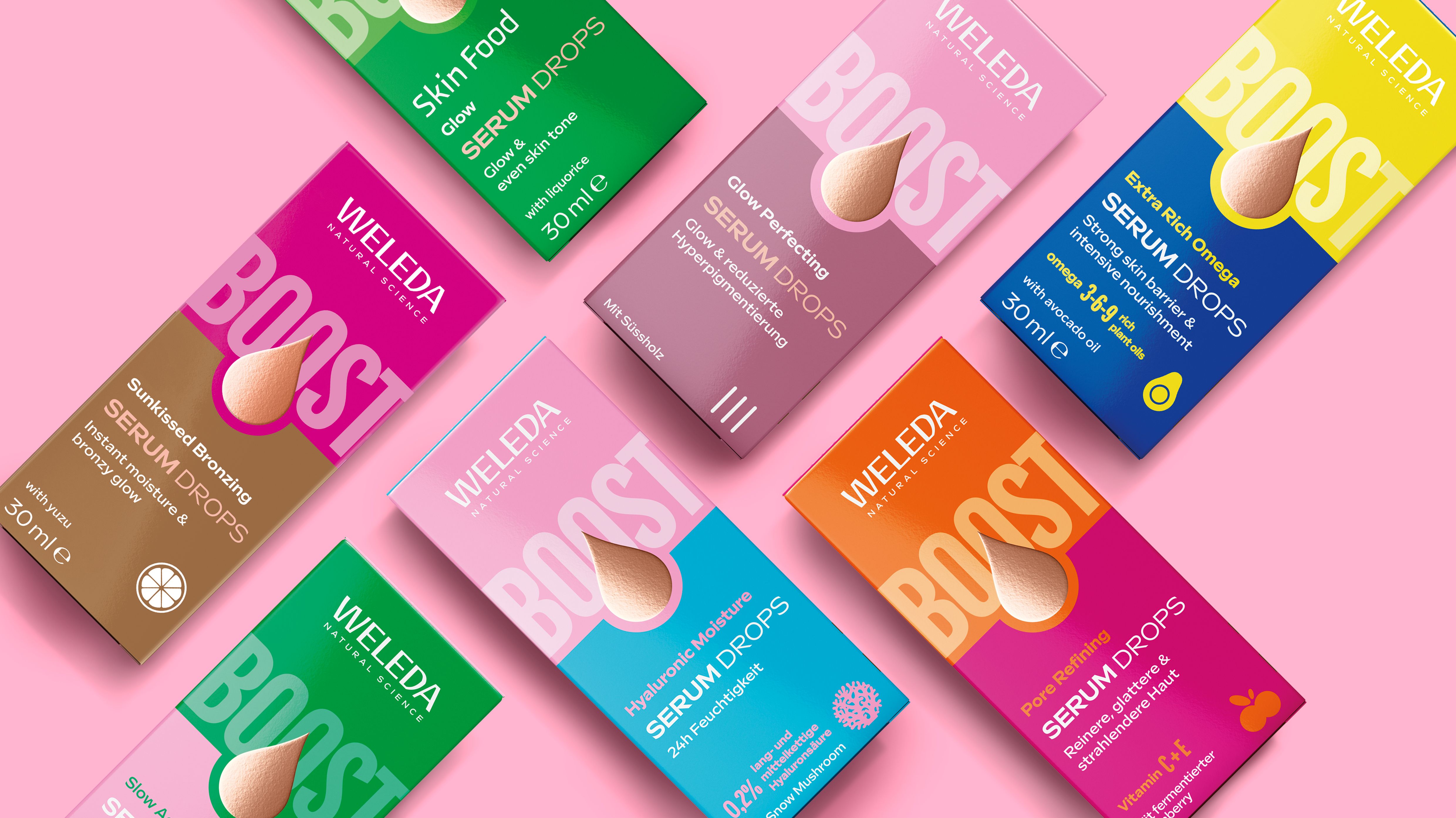
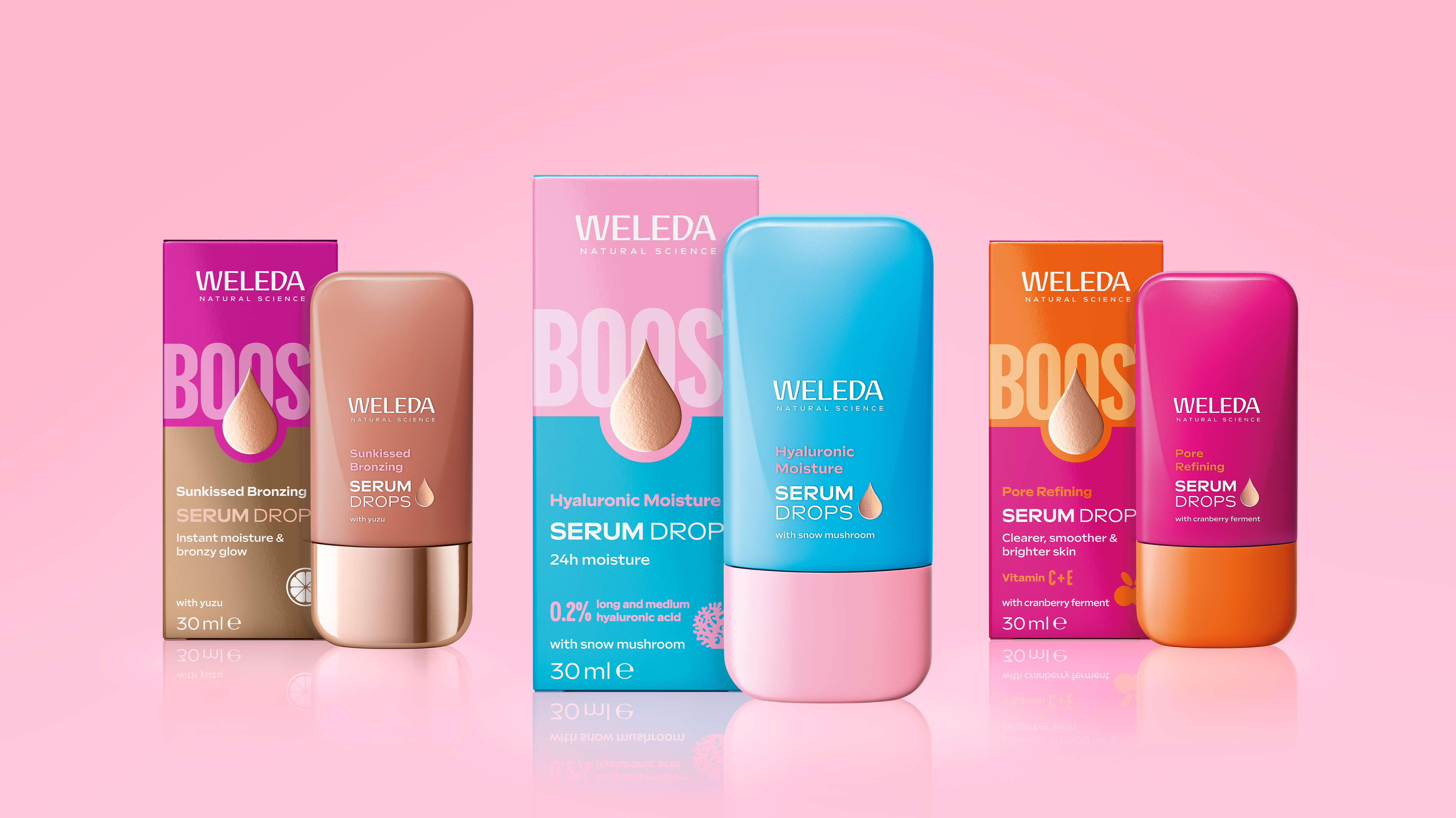
Weleda Booster Drops. Packaging design & image courtesy of EPDA member baries design.
BEHIND THE COLOUR: WELEDA BOOSTER DROPS BY BARIES DESIGN
When Colour Becomes Part of the Design System
The complexity of colour becomes particularly interesting when it has to work across an entire packaging system.
For Weleda Booster Drops, EPDA member baries design developed a colour-coded range in which colour helps distinguish the different products while creating a coherent overall identity. We asked the team how they approached colour across the range and what guided their design decisions.
Questions for baries design
1. Colour plays a key role in the Booster Drops range, helping to differentiate the products while maintaining a sense of coherence. What was your approach to developing the colour palette for the different variants?
We treated color as a key part of the range architecture. It needed to give each variant a distinct presence, reflect its featured ingredient, and maintain a coherent, recognizable Weleda identity. The vivid colors and strong contrasts create a contemporary, energetic look for a Gen Z audience while giving consumers an immediate visual cue for each formula. The clean design, central droplet, and the Weleda logo provide consistent brand cues across the range.
2. The packaging combines a variety of materials and finishes, including the distinctive foil droplet. What factors did you need to consider to ensure that the colours and the overall identity worked across the various packaging elements?
We approached the packaging as a cohesive visual system, with each element playing a defined role. Color creates impact and communicates the featured ingredient, while the central droplet serves as the key visual. We deliberately chose rose-gold foil for the droplet to reinforce the product’s serum character and give the design a contemporary quality that resonates with Gen Z. The Weleda logo remains clear and recognizable, and the foil enhances the droplet without competing with the brand or essential pack information.
3. How important is it for you to consider how a colour will behave beyond the screen and in production when you develop a colour for packaging?
A screen image is only an initial reference. The substrate, printing process, and surface finish can all influence the final color and contrast, particularly in combination with foil. That is why production requirements need to be considered from the start of color development. For Booster Drops, we used Pantone references to define the colors clearly and provide a reliable basis for color matching and print production. We also specified smooth cardboard early on, so the color decisions could be made with the intended substrate in mind. Colors should ultimately be assessed under conditions that closely reflect production. This ensures that the defined brand image provided to WELEDA’s suppliers is consistently maintained and implemented throughout the entire process – from the design of the print artwork right through to the finished packaging.
From the designer’s colour to the production reality
A project like this shows that colour is never simply something chosen on screen.
Once a colour becomes part of a packaging system, it has to travel through materials, finishes, printing processes and production environments, while still communicating the same brand idea.
And that brings us back to the question: what exactly are we communicating when we specify a colour?
The DNA of a Colour
LAB coordinates describe how a colour appears under specific calculation and viewing conditions. What they do not reveal is how that colour is actually built.
This is where spectral data comes into play.
Two inks can produce nearly identical LAB values and still behave very differently when the lighting changes. This phenomenon is known as metamerism.
Or, to put it another way:
Under office lighting, two colours may look like best friends. Under daylight, they suddenly pretend they’ve never met.
For designers, printers and brand owners, that can quickly become a costly surprise.
CxF: The Digital Passport for Colour
CxF stands for Color Exchange Format, an XML-based standard designed to exchange colour and process-control information across different software systems.
While LAB values provide only a snapshot, a CxF file can store significantly more information, including:
• CIELAB values
• XYZ data
• Spectral reflectance data
• Measurement specifications
• Illuminant and observer settings
• Measurement geometry
• Instrument information
• Additional metadata
As a result, a colour becomes more than just a numerical target. It becomes a complete digital colour record.
Put simply:
LAB describes the face of a colour. - CxF captures its entire personality.
One Colour Reference for Everyone
A colour often travels through a long supply chain:
Brand Owner → Prepress → Ink Supplier → Printer → Quality Control
Each stakeholder has a different role, but everyone should be working towards exactly the same colour.
By using a shared CxF target, all parties can reference the same digital standard throughout the workflow.
This helps to:
• Reduce transcription errors
• Eliminate conflicting LAB values
• Improve traceability
• Reduce dependence on ageing physical standards
• Support objective comparisons across multiple production sites and suppliers
• Enable formulation, lab approval, press control and final verification from a single source
Or, more simply:
The fewer people manually copying colour values, the fewer colour surprises appear at the press.
Guest perspective: Lisa Cain
Lisa Cain is a design strategist and writer specialising in sustainable packaging. With over 30 years’ experience leading creative and technical teams worldwide, she explores how design, innovation and sustainability shape the future of packaging. Follow Lisa's work and insights on LinkedIn.
For this article, Lisa shares her perspective on the Weleda Booster Drops project and what it raises for her from a brand and design point of view, before putting a question directly to Thomas.
Weleda has spent more than a century building a brand associated with natural skincare, yet Booster Drops looks very different from what we’ve come to expect. Vivid colours, strong contrasts and rose-gold detailing bring a fresh, youthful energy to the range while retaining enough familiarity to feel unmistakably Weleda. It’s a distinctive visual departure, and one the brand will want to protect as the portfolio evolves.
Having worked for major brands, I know firsthand how difficult colour consistency can be during a significant redesign. Considerable investment goes into strategy, design development and colour approval, only for variations to emerge as projects move into production.
The challenge is rarely confined to the initial launch. Issues often emerge years later when new SKUs are introduced, existing artwork is refreshed, or production moves between suppliers and sites. By that stage, original references may have aged, substrates may have changed, and colour standards may have been interpreted differently across regions and supply chains.
Even when everyone works from the same approved colour reference, there is still the age-old challenge of lighting conditions. A colour that appears perfect under a light box can look noticeably different under supermarket LEDs or natural daylight. Two formulations may deliver identical Lab* values yet appear very different as lighting conditions change.
From a brand perspective, Thomas’s explanation of spectral data highlights an important consideration. Colour standards are not simply about matching a target at the point of approval. They need to remain reliable over time, across different print partners, production environments and future product launches.
Lisa asks Thomas:
What advice would you give designers and brand owners when defining colour standards at the outset of a project? How can they build greater consistency into briefs, specifications and approval processes so those standards remain robust as brands grow, diversify and move across different production environments?
Thomas Polster responds:
Start taking ownership of the process and the outcome.
First, assess which key substrates are being printed with which printing technologies and focus your efforts on achieving a high level of colour consistency across the three most important substrate/print-process combinations.
Trying to optimize everything at once will only dilute resources and results.
If Pantone colours are part of the workflow, I strongly recommend implementing PantoneLIVE (digital) as the standard. If the objective is even greater colour accuracy and predictability, particularly in packaging printing, then leverage Dependent Libraries and build your workflows around them. The absolute best approach is always to use a brand colour with its own code and name.
In addition, make use of support from industry partners and specialized vendors who can assist in the creation and maintenance of CxF files. At present, there is simply no more robust and reliable method for communicating colour intent and colour data throughout the value chain.
Finally, avoid specifying colour tolerances whenever possible. If tolerances are unavoidable, define them as tightly as possible. Every additional degree of tolerance introduces room for interpretation. Any interpretation will straight lead to variation in colour appearance and hue. The tighter the specification, the greater the likelihood of achieving consistent and repeatable colour reproduction across all stakeholders in the process.
And finally: don’t let all those so-called experts impress you with their specialized jargon and metrics… even the smallest and simplest control variable can point us in the right direction.

So, What Is the Right Colour Tolerance?
One of the most common questions in colour management is: “What ΔE tolerance should we use?”
The honest answer is: there is no universal ΔE value that perfectly represents human vision.
Colour perception depends on many factors, including:
• Hue
• Surface characteristics
• Viewing conditions
• Light source
• Observer
• Whether samples are compared side-by-side
For small colour differences, ΔE00 has become the preferred calculation method because it correlates more closely with visual perception than the older ΔE*ab formula. Within hubergroup’s offset colour matching process using HDCC, the target is typically:
• ΔE < 0.5
• ΔH < 0.5
And when real-world production conditions make that impossible, perhaps due to challenging substrates, contamination, matte coatings or other process limitations?
The priority becomes: keep the hue aligned.
Because most people tolerate slight shifts in lightness better than an obvious change in colour character.
A blue that looks slightly darker is still blue. A blue that suddenly starts looking purple is a different conversation altogether.
Why Designers Should Care
Most design decisions begin on a screen. However, brand colours eventually need to perform across a wide range of materials and printing processes:
• Packaging
• Labels
• Corrugated board
• Flexible films
• Digital printing
• Offset printing
• Point-of-sale materials
A LAB value alone is often not enough to ensure consistent appearance across all those applications.
CxF allows colour intent to be communicated with far greater precision, helping everyone from formulation specialists to printers reproduce the designer’s vision more reliably.
And ultimately, that is the goal: Not for a colour to look good only on a monitor. But for it to look right everywhere.
Conclusion
CxF transforms a colour target into a portable digital standard.
For ink manufacturers, it provides a reliable spectral foundation for formulation and measurement.
For printers, it creates a common reference for production control and quality assurance.
For brand owners, it reduces interpretation as colours move between companies, locations and technologies.
And for designers? It offers reassurance that the carefully selected brand colour will not embark on a creative journey through the supply chain and return looking like a distant relative of the original.
Because colours have an identity. CxF helps preserve it.
Thomas Polster and colleagues: Graham Cooke, hubergroup Colour Communication · Ricky Harrynarine, Head of Colour Communication
Connect with the colour experts
As an EPDA member, you can benefit directly from Thomas Polster’s extensive knowledge and expertise in colour reproduction and print production. Thomas welcomes contact requests and is available to support your specific projects and questions.
Contact Thomas at Thomas.Polster@hubergroup.com or on +49 170 330 91 64.
Coming next – Athens
HUMAN AFTER ALL — EPDA Conference 2026
Thomas Polster will take the conversation further at the EPDA Athens Conference, exploring the challenges of colour communication and production in even more detail.
12–13 November 2026 · Athens
https://www.epda-design.com/events/human-after-all