Colour: Selection, Communication & Matching - Part 1
Part 1: Choosing a Brand Colour Is a Production Decision - by Thomas Polster, hubergroup
In the second article of our editorial series with hubergroup, Thomas Polster explores one of the most consequential decisions in brand identity: how to choose a colour that not only looks right — but performs consistently across offset, flexo, gravure, and digital printing.
What you will learn in this article:
• Why brand colour selection starts with printability — not aesthetics alone
• Practical strategies to reduce colour variation and achieve predictable print results
• Best practices for creating reproducible brand colours across substrates and printing technologies
"I am taking on the challenge of translating a complex topic, one that has been extensively discussed, analyzed, and debated, into practical and actionable insights. It is a topic that affects us every day and, quite often, causes its fair share of headaches. My goal is to sharpen and deepen your decision-making foundation and, perhaps, encourage you to pick up the phone and seek feedback whenever doubts arise.
The topic is COLOR. More specifically, it is about color communication, compliance with color standards, and the strengths and weaknesses within the color management process. I would like to share practical insights and recommendations that enable us to work even more professionally and effectively.
Technical expertise is important, and technology is becoming increasingly critical. Yet, in the end, it is people who make change possible. Human capability, collaboration, and decision-making often determine whether an initiative fails or whether it achieves a lasting and sustainable impact.
Let us begin with the selection of a spot color, or more specifically, a brand color, which is often a decisive factor in creating and maintaining a consistent brand identity. The definition of a color influences not only a brand’s visual appearance but also its technical reproducibility across different printing processes, printing presses, substrates, and color systems. Most printed designs are built either entirely in CMYK or in combination with one or more spot colors.
Spot colors are used as pre-mixed printing inks, with the most widely recognized system being PANTONE®.
Advantages of Spot Colors
• Good colour accuracy, provided that certain important factors are taken into consideration. More on that later...
• Ability to reproduce colours that fall outside the CMYK colour gamut
• Exceptional vibrancy, particularly for orange, green, blue, and metallic shades
Disadvantages of Spot Colors
• Additional printing units are required
• Often not directly available in digital printing applications
Of course, printing would be unimaginable without CMYK. I do not need to explain that colour shades are created through the screening and overprinting of the four process colours.
Advantages of CMYK
• Cost-effective
• Standardized, particularly within commercial printing
• No additional printing units required
Disadvantages of CMYK
• Limited Colour-Gamut
• Colour variations depending on the printing process and substrate
• Brand colours often cannot be reproduced with complete accuracy
Many brand colours fall outside the CMYK colour gamut.
Particularly challenging are:
• Bright orange shades
• Intense reds
• Strong violet tones
• Highly saturated greens
• Turquoise and cyan variations
• Fluorescent (neon) Colours
• Metallic Colours
When such colours are defined exclusively in CMYK, significant colour shifts frequently occur.
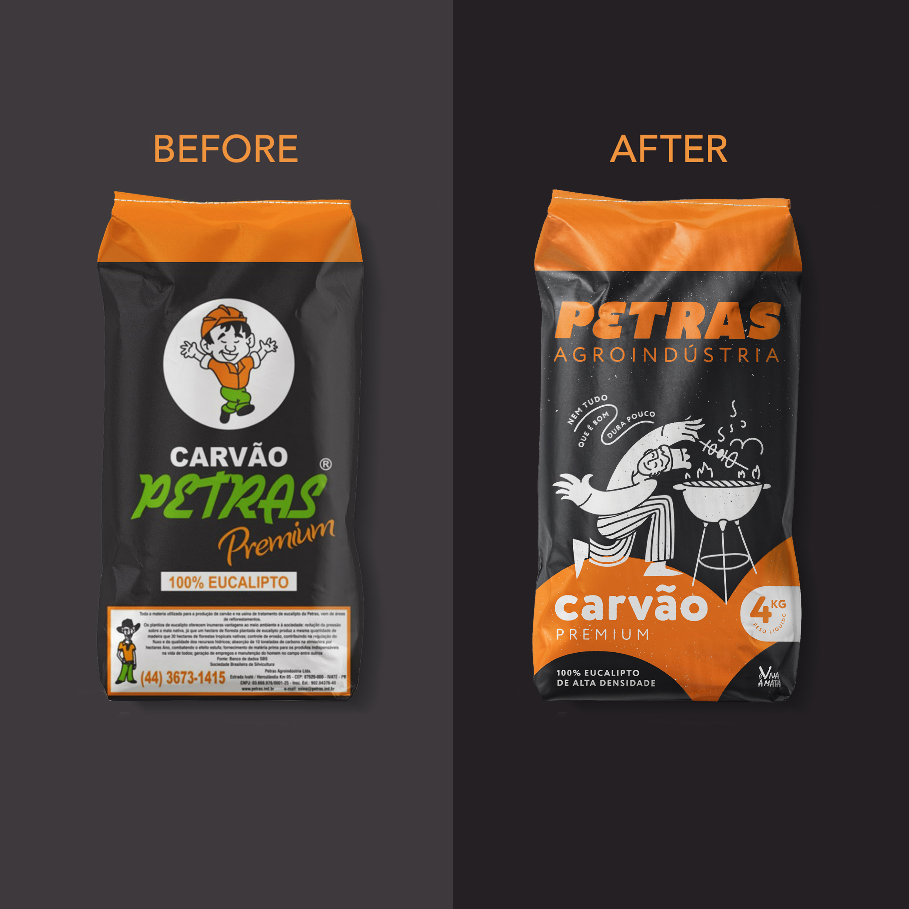
For example, a highly vibrant Pantone Orange may appear in CMYK printing:
• Less vivid or vibrant
• Darker in appearance
• Less saturated
Please also remember my presentation held at the epda event in Hamburg, where I introduced you to the power of GCR (Gray Component Replacement) as a highly effective method for stabilizing colour reproduction in CMYK printing. Proper GCR implementation can significantly improve colour consistency and reduce print variation throughout a production run. If anyone would like a refresher on GCR and its impact on colour stability, please feel free to reach out.
Whenever possible, these considerations should be taken into account during the selection of a brand colour. Otherwise, we must accept the limitations associated with different printing technologies across a product range and work to minimize their impact as much as possible.
The influence of the printing process on colour reproduction should never be underestimated.
Offset Printing for Packaging
• High quality standards
• Good spot-colour reproducibility
• Stable colour results
• The wide variety of substrates can negatively affect colour appearance
Flexographic Printing
• Greater colour variation due to differences in printing plates and substrates
• Spot colours are often required to maintain consistent brand colours
Gravure Printing
• High Colour consistency
• Particularly advantageous for long print runs
• Ideal for premium and high-quality packaging applications
Digital Printing
• Limited Colour gamut
• Pantone colours can often only be approximated rather than reproduced exactly
• Modern expanded-gamut systems (e.g., CMYKOGV) significantly improve colour reproduction capabilities
Conclusion
The selection of a brand colour is not merely a design decision; it is, above all, a printing and production decision.
A colour that appears visually attractive may prove unsuitable if it cannot be reproduced consistently across different printing processes and substrates. Professional brand colour management should therefore always begin with an evaluation of colour performance in both spot-colour and CMYK workflows, as well as an assessment of the relevant colour gamut limitations.
Ideally, a brand colour should be defined as a standardized spot colour and complemented by optimized CMYK, RGB, and LAB values to ensure a consistent brand experience across all media channels and production processes.
The selection of the right spot colour should not be based solely on choosing the most visually appealing shade from a Pantone guide. Whenever possible, the decision should be driven by the colour’s technical reproducibility across all relevant applications and production environments.
For this reason, professional brand development projects should more frequently begin with a comprehensive print feasibility and colour reproduction assessment.
Such an approach reduces risk, improves consistency, and helps ensure that the chosen brand colour performs reliably throughout the entire packaging supply chain."
A real case of consulting - by Paula Pozza, Studio Zak
Paula Pozza is the Founder & Creative Director of Studio Zak, a brand and packaging design studio renowned for its bold, colour-driven approach to visual identity. Having worked with clients ranging from established brands undergoing a redesign to companies developing their identity from scratch, Studio Zak has first-hand experience of the challenges explored in this series. Having already spoken with Thomas Polster about colour reproduction, her perspective is all the more grounded in real practice.
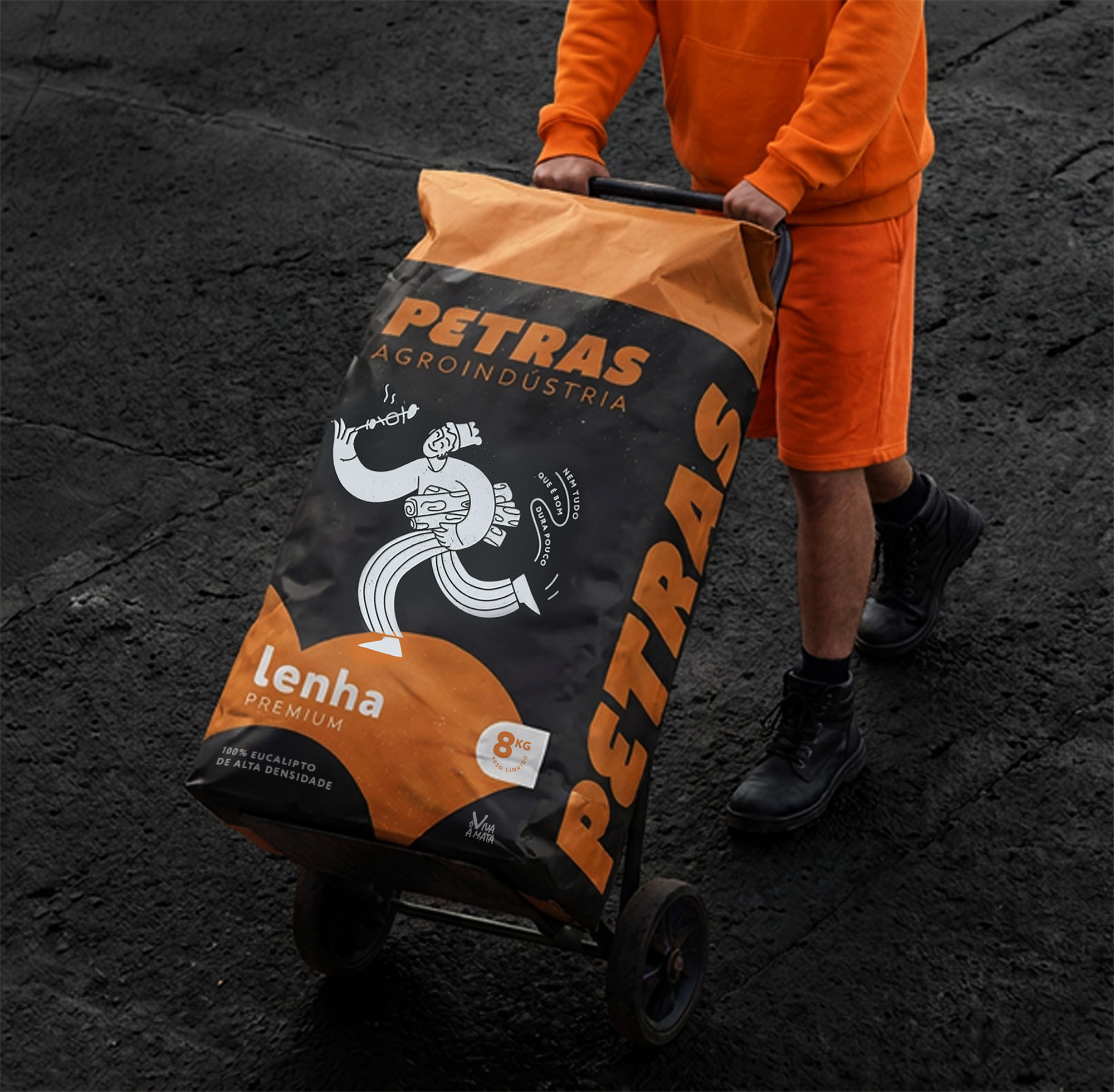
"There are two ways colour may come up in a project: when a brand that already has a legacy and a colour known by its consumers comes to us for a redesign, or when it’s a new project that we can start from scratch.
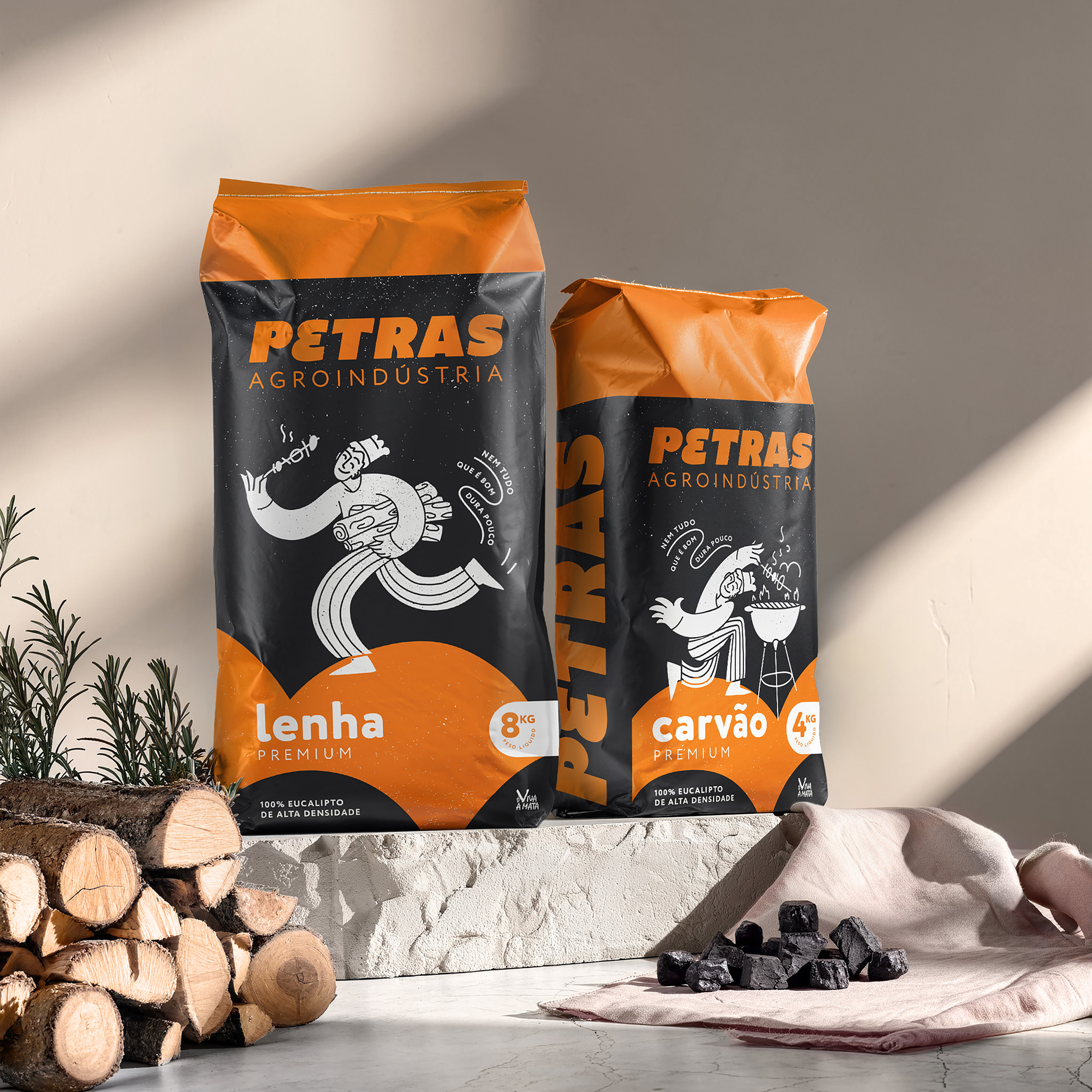
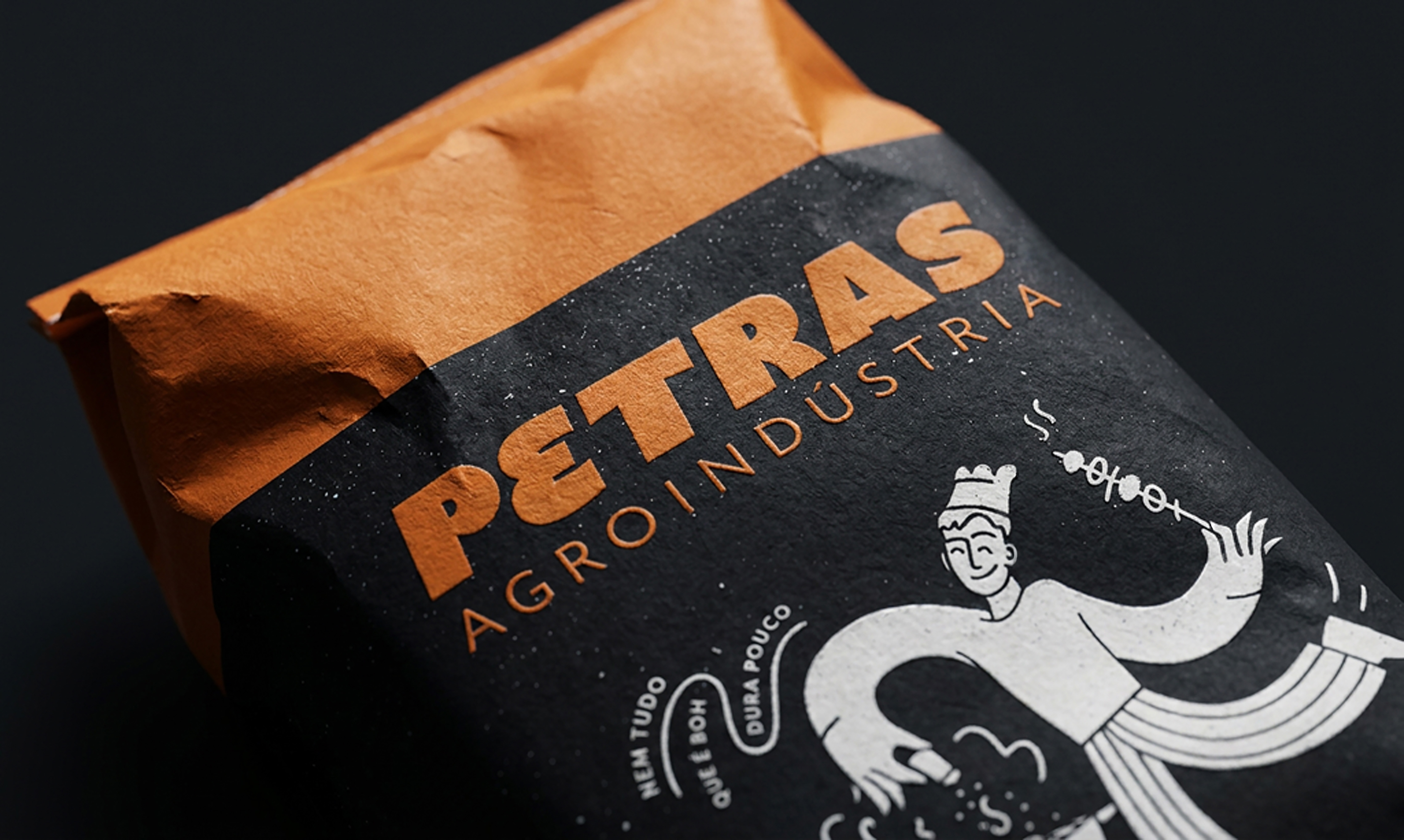
Take Petras for instance. When we were working on the rebranding and redesign of their packaging, we knew we couldn’t touch their orange and black. They were highly recognised by those colours. And orange, as Thomas mentions, can be particularly difficult to reproduce consistently. But changing it to something easier to reproduce wasn’t really an option. The challenge here was making sure every touch point (uniforms, trucks, print materials as well as packaging) used the same orange.
When we do have the chance to start from scratch, of course we can think about printability much earlier and choose a colour knowing how it will behave in different applications. But I don’t think colour can be chosen based on printability alone. There is still the strategy behind that choice, how recognisable it can become, how it differentiates the brand and also whether it is the right colour for that brand.
And even when we make the best possible choice, complete colour consistency is sometimes almost impossible. Today we’re not only designing for different printing processes and substrates, but also for digital applications, where the same colour can look different from one screen to another.
But I’ll go further, and this happens quite a lot when we work with small to medium companies, who don’t have a marketing department (or even those who do actually). People will print things in their offices, they’ll run to the local printer for “a quick ad”, and a supplier will prepare something themselves without going through a design check. So how can we avoid mistakes on their end?
When we prepare the files ourselves, we know which colour system we’re working with, how the artwork should be prepared and what needs to be checked in production. But that’s simply not the reality of everything a company will produce over the lifetime of a brand.
As agencies we can define colour values, prepare the files correctly and create brand guidelines, but we cannot fully control what happens in production.
How much of that inconsistency can actually be prevented by thinking about printability earlier in the process, and how much simply comes down to production?"
→ Thomas Polster responds:
"It’s certainly hard to quantify and heavily depends on the players involved in the supply chain, but a double‑digit percentage can definitely be prevented by thinking about printability early on — the rest is pure, unforgiving production reality. However, anyone who only starts considering printability once the printing begins shouldn’t be surprised when things descend into chaos. Passing responsibility down the line or trusting that “it’ll work out somehow” has never ended well.
If you want more consistency for your brand colour, start now. Don’t miss the opportunity."
As an EPDA member, you can benefit directly from Thomas Polster’s extensive knowledge and expertise in colour reproduction and print production. Thomas welcomes contact requests and is available to support your specific projects and questions. Contact Thomas at Thomas.Polster@hubergroup.com or on +49 170 330 91 64.
BRAND COLOUR CONSISTENCY SERIES
→ PREVIOUS ARTICLE: You missed to read about "Why your design decisions matter more than you think?" Read here.
→ COMING NEXT: Colour selection, colour communication & colour matching – PART 2
In Part 2, Thomas explores how to communicate your chosen brand colour digitally — and why the tools we rely on may not always be enough.