Your account has not yet been approved. This is a manual process.
Log out
Members
Join
Resources
Login
Log out
Who we are
About epda
Our team
Members
epda book
What we offer
Events
Resources
Design school collabs
Jury membership
Tradeshow commitment
Exchange
News
Our partners
Connect
contact us
News Flash Sign-up
FAQ
Members
FAQ
Resources
Login
Log out
Who we are
What we offer
What we stand for
News
Our partners
Connect
About epda
Our team
Members
epda book
Events
Resources
Design school collabs
Fair Pitches Only
Contact us
News Flash Sign-up
FAQ
Who we are
About epda
Our team
Members
epda book
What we offer
Events
Resources
Design school collabs
What we stand for
Fair Pitches Only
News
Our partners
Connect
Contact us
News Flash Sign-up
FAQ
NEWS
Explore the latest
news & views
Discover insightful content, expand your knowledge and stay up-to-date on what we're doing.
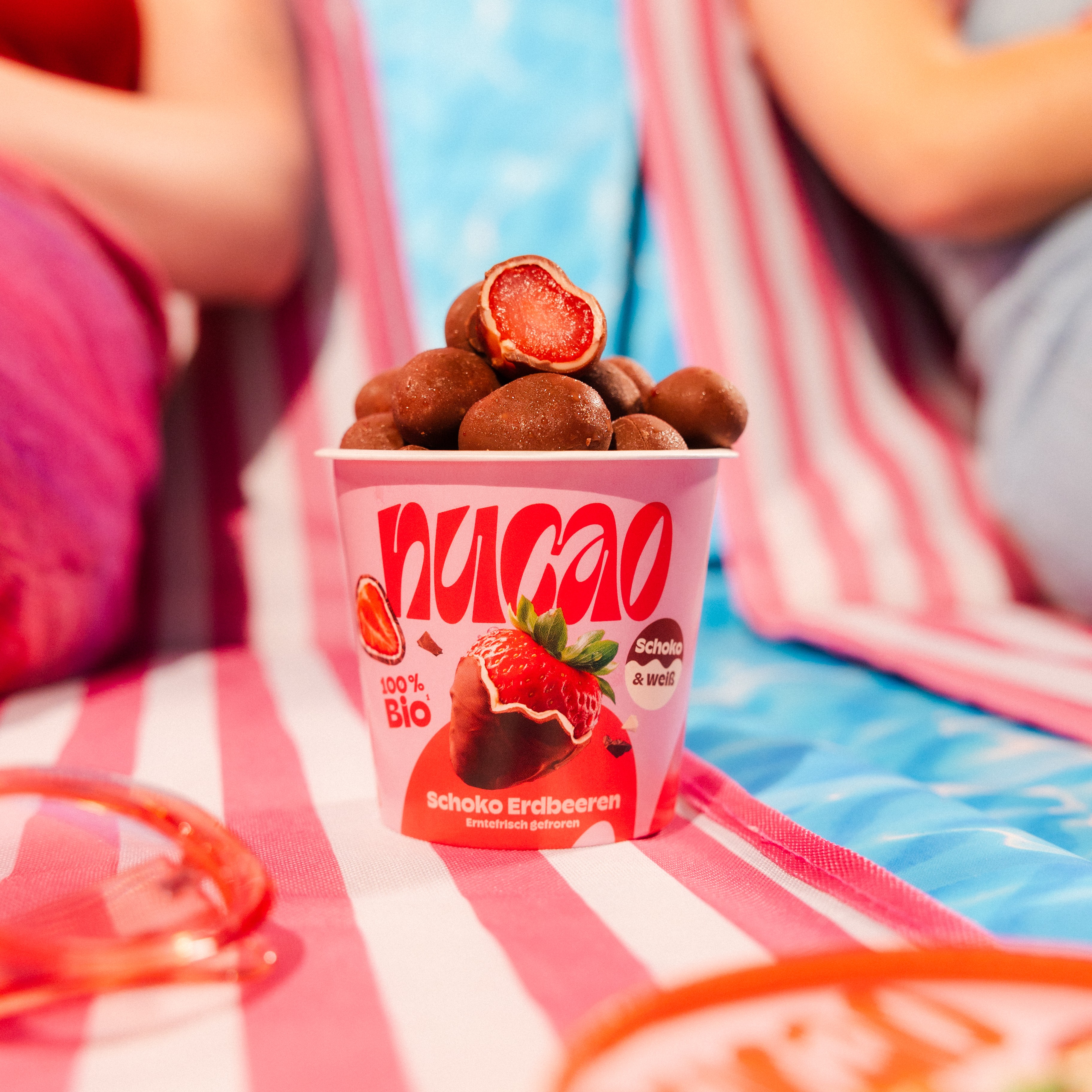
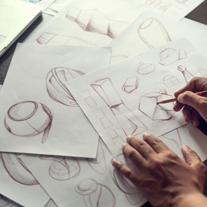
When Packaging Becomes Content
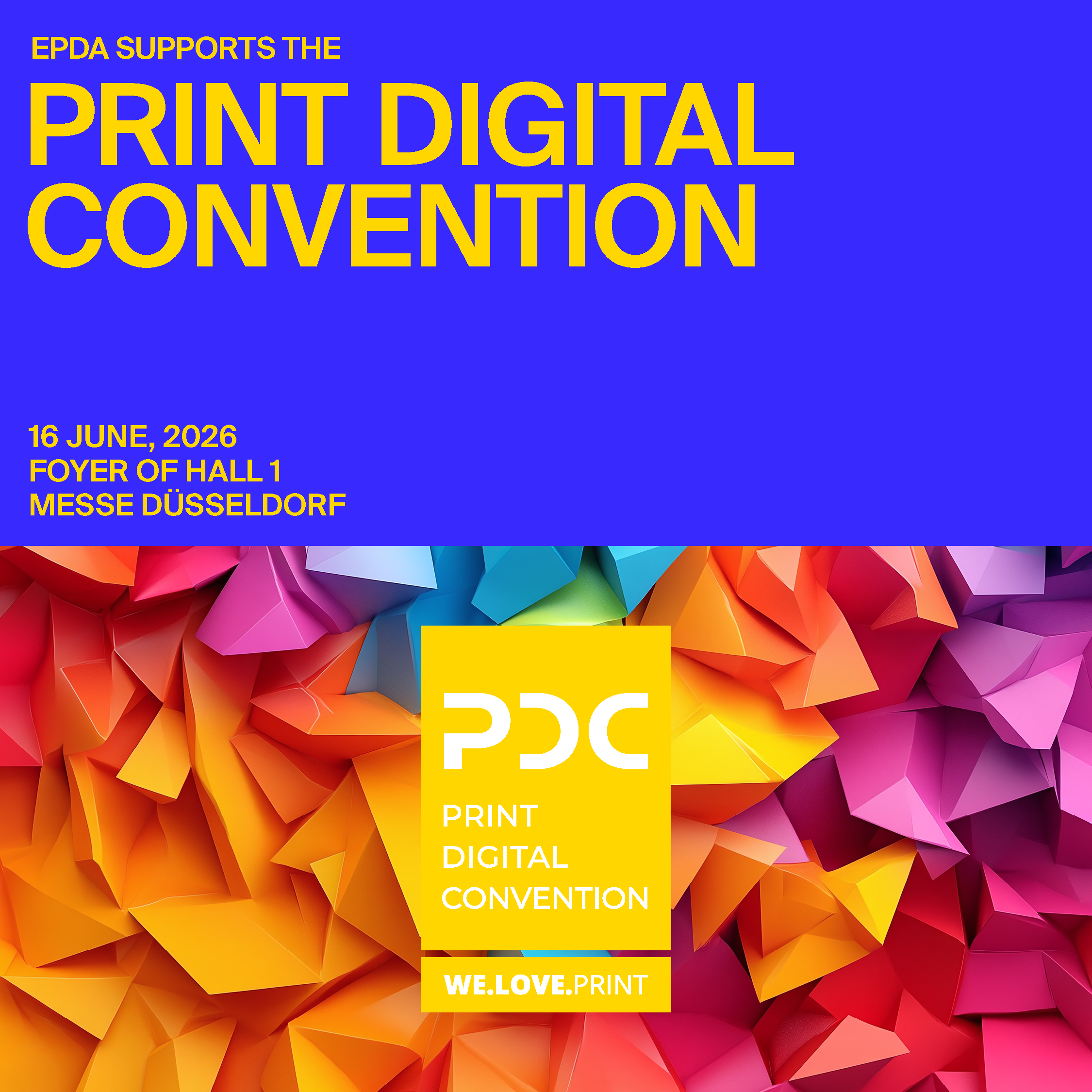
Collaboration throughout the value chain: Key take aways from the NUCAO talk at PDC 2026 in Düsseldorf on 16 June.
Learn more
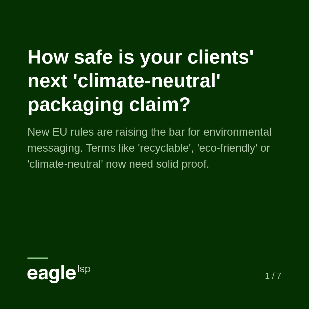
Greenwashing on Packaging: What You Can No Longer Claim
epda's LIVE FLASH on July 7th in collaboration with eagle LSP provided insides into the new rules for environmental messaging. The session encouraged us to help our clients navigate theses changes.
Learn more
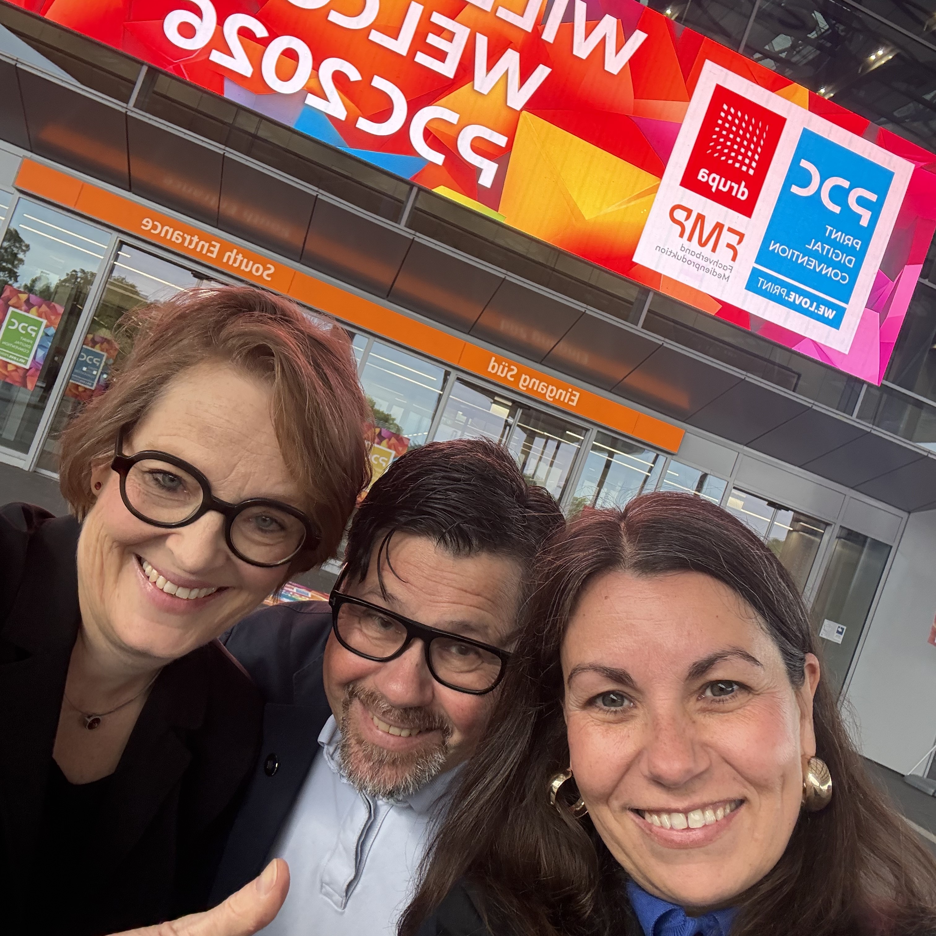
What We Learned at the Print Digital Convention
A designer's daily work is filled with meetings and all sorts of design tasks - all while juggling tight deadlines and numerous constraints. We want to encourage creatives to attend technology events from time to time.
Learn more
Why your design decisions matter more than you think
At EPDA, we believe great branding doesn't stop at concept. It lives through every touchpoint — including the way colour appears, behaves, and is perceived in the real world. That's why we are launching a new editorial series together with our industrial partner hubergroup, exploring the many factors that influence brand colour reproduction and perception across packaging and print production.
Learn more
What we have learned in Helsinki!
Across two inspiring days in Helsinki, one message resonated throughout the conference: meaningful design takes time, attention, and intention. More than ever, design is about creating value through connection, creativity, and responsibility. Our speakers challenged us to rethink branding and packaging through the lenses of social sustainability, inclusivity, and human-centred design.
Learn more
A deodorant for eleven friends!
It looks simple, but it becomes complex when you want to turn the bestselling product of a global brand into a “limited edition.” Unilever, together with its agency Alvons Design, ventured into new territory here. Meet them at PDC Düssedorf on 16 June to hear their story.
Learn more
Between Hype and Real Value: AI in Design for Brands
Artificial intelligence is changing the rules of the game. But what is truly relevant for brands, design, and marketing? We look forward to hearing Caroline Mörnås (Paulig) and Tim Gelzleichter (WIN Creating Images) cut through the noise and focus on what really matters: Join PDC in Düsseldorf on 16 June 2026 and attend their talk!
Learn more
How optimism can be an antidote to the uncertainties in the world.
Don't miss the talk by Sanna-Kaisa Niikko, Chief Marketing Officer at the Finnish lifestye brand Marimekko, joining us at our upcoming conference in Helsinki on 12 June 2026. Learn more here and register now.
Learn more
It's all about people: Claudia Josephs
Here is Claudia for you. Perhaps you have read her name or even know her since she is your first contact when you reach out to epda. Learn more about her!
Learn more
Scan me if you can!
Meet Thomas Vollmuth, Head of Brand Owner Management at Koenig & Bauer Kyana, and Claudia Friedrich, Head of Competence Center Packaging at GARDENA at PDC in Düsseldorf on 16 June 2026 and learn how AI, AR, image recognition, and digital twin technology are revolutionising packaging marketing.
Learn more
It's all about people: Dochita Zenoveiov
Here is Dochita Zenoveiov for you: A teacher by vocation, the founder of epda member INOVEO and an active brand strategist since 1999.
Learn more
From Print to Feed: How Packaging Drives Social Reach
Visit PDC in Düsseldorf and learn from Fabian Dudek (Nucao) and Tom Streefkerk (colordruck Baiersbronn) how packaging design can be strategically used to capture attention and organically increase social media reach.
Learn more
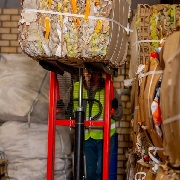
Does AI have a role to play in circular packaging design?
AI could have a major role to play in achieving the goal of more sustainable packaging design.
Learn more
Design meets print innovation!
We are thrilled to participate in the Print Digital Convention 2026, part of the global drupa alliance, taking place 16–17 June 2026 at Messe Düsseldorf.
Learn more
It's all about people: Federica Marroni
Get to know the team behind Paula Pozza, owner of Studio Zak, Italy/Brazil: meet Federica! She has been part of the team that created the fantastic design concepts for our Label Design Challenge.
Learn more
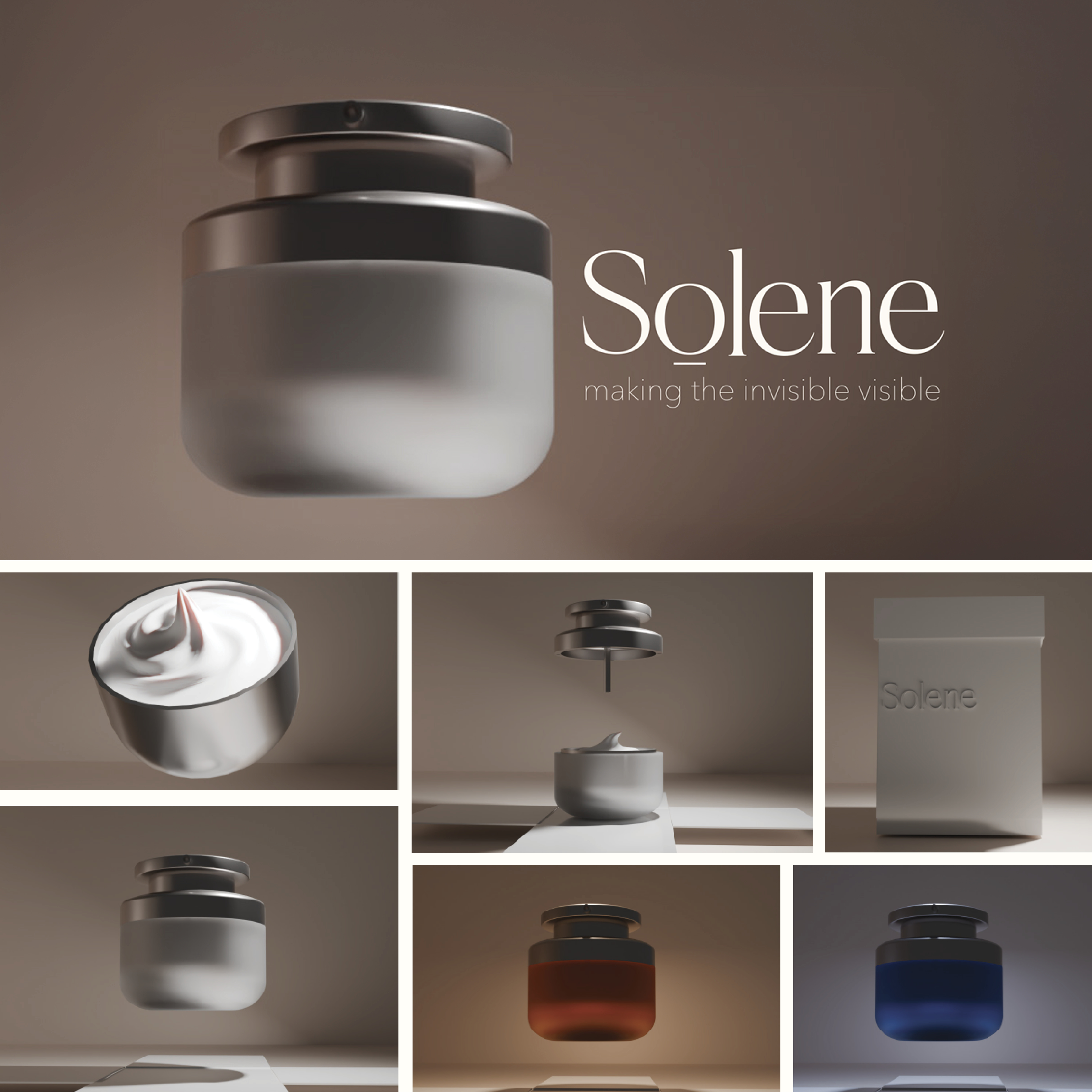
THE NEXT COLOUR LANGUAGE
We congratulate all winning teams from the Warsaw University of Fine Arts on their great submissions to the epda FUTURE PACKAGING AWARD 2025/2026. Bravo!
Learn more
Label Design Challenge: A light that lasts
We are delighted to present the nominated design concepts entered to the epda Label Design Challenge.
Learn more
Label Design Challenge: A light for hope
We are delighted to present the nominated design concepts entered to the epda Label Design Challenge.
Learn more
THE NEXT COLOUR LANGUAGE
We congratulate all winning teams from Zuyd University on their great submissions to the epda FUTURE PACKAGING AWARD 2025/2026. Bravo!
Learn more
The Rethinking Materials Summit, April 28-29, London
Brands, innovators, investors, and policymakers will explore the next frontier of materials innovation. Book via epda to get a 10% dicsount of the full summit price!
Learn more
It's all about people: Anne Luneau
Here is epda member Anne Luneau for you. In 2017, she opened her "Brand Boutique" as a Creative Strategist.
Learn more
"AI in Design: Legal Essentials", 24 March 2026, 12 pm CET
This is a must-attend-webinar for every designer: Learn from Sergio Rizzo, Member of the Boards of Appeal, EUIPO, how you can protect your traditional but also AI-created designs and how to avoid any potential infringements. REGISTRATION IS OPEN!
Learn more
Live Flash Hosting
Christian Prill will become permanent host of the epda Live Flashes.
Learn more
Relaunch of epda online events
In 2026, we will host two compact, high-impact 1-hour live online sessions, alternating with our two annual conferences.
Learn more
THE WHITE BOX CHALLENGE
In 2026, epda introduces its brand-new concept of design school collaboration: a great opportunity for design schools to show the best of their students with the most compelling project.
Learn more
Team Créatif Group - 40 years of agency history
We warmly congratulate Sylvia and her amazing team on this outstanding milestone.
Learn more
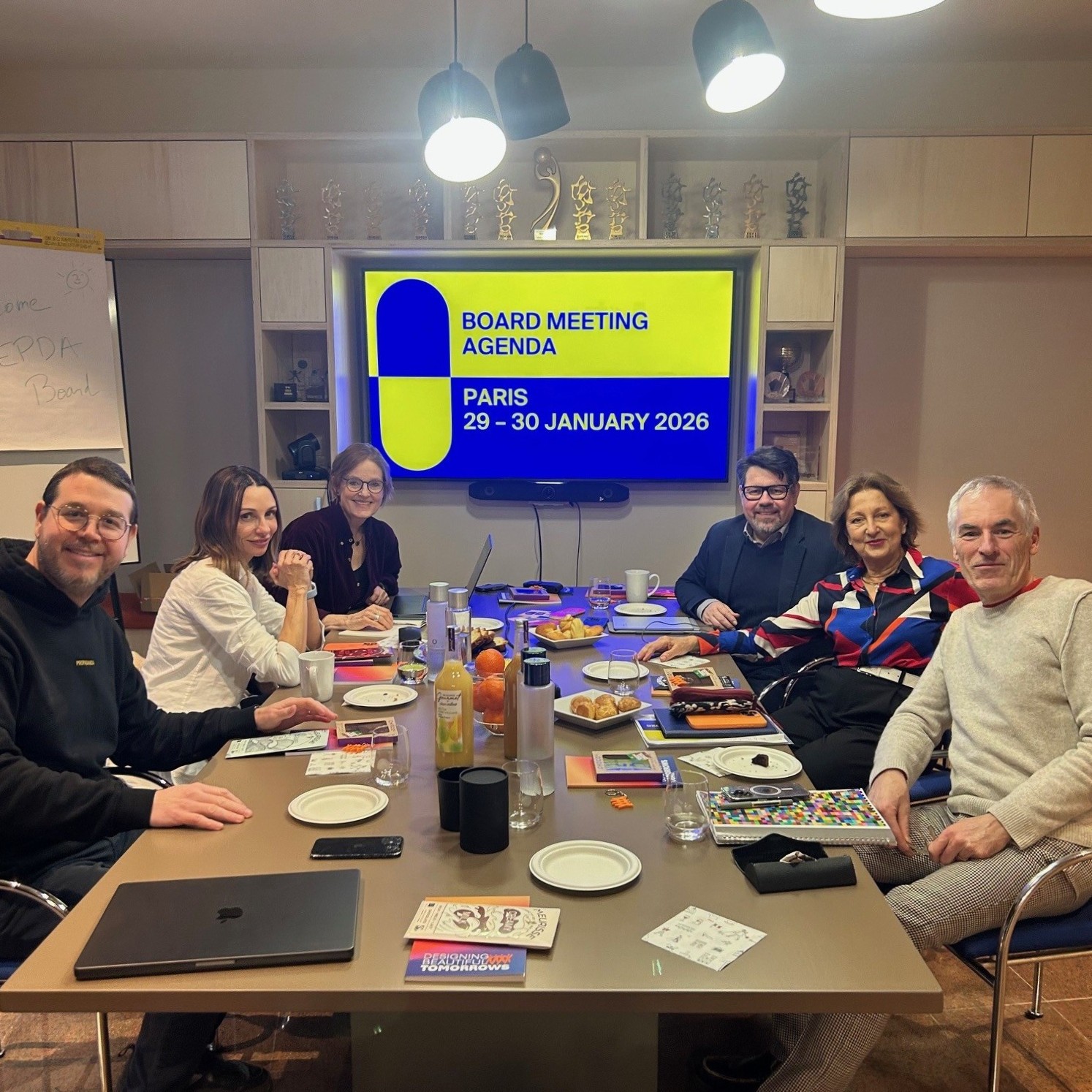
EPDA Board Meeting in Paris, 29-30 Jan 2026
From brainstorming sparks to concrete plans, the epda Board got together to plan this year's activities and events.
Learn more
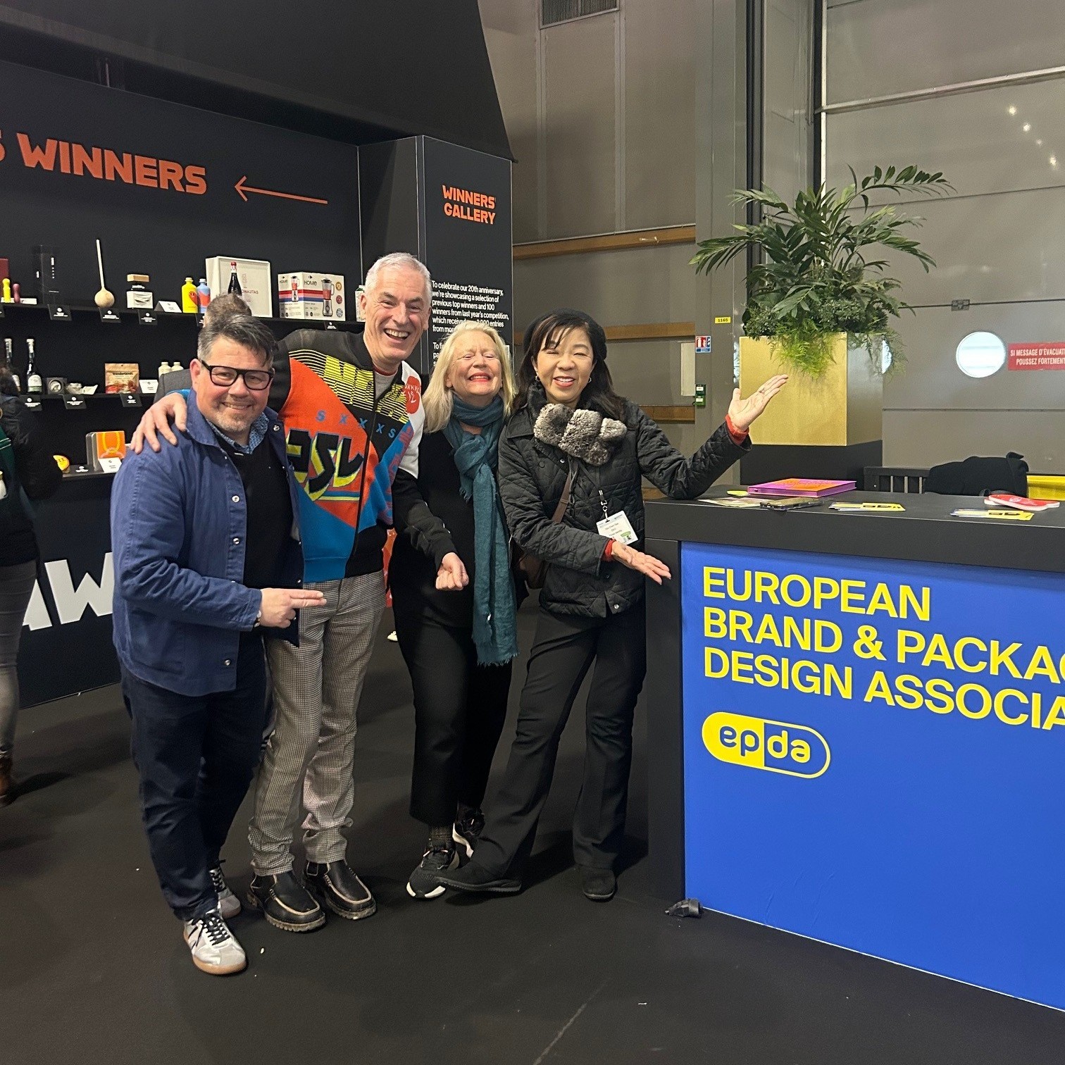
Creative buzz at Paris Packaging Week
epda hosted a panel at the Pentawards Festival
Learn more
Your Nordic Design Trip: Now Open for Planning
Preparations for our spring event are in full swing .. We have put together a rich programme to inspire you and to provide you with news and knowledge to help you thrive in today’s world of design
Learn more
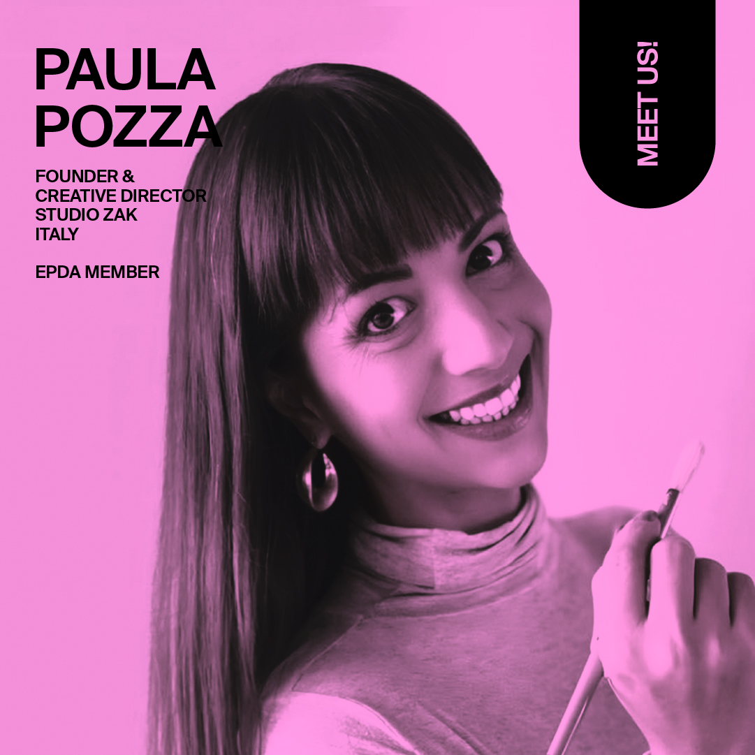
It's all about people: Paula Pozza
Get to know Paula Pozza, speaker at our upcoming conference in Helsinki on 12 June 2026
Learn more
A Happy New Year 2026
A new year has begun, offering a fresh opportunity to continue doing what we value and what we have been proud to achieve in the past. At the same time, the turn of the year invites us to begin something new, to think differently and to remain open to new ideas and perspectives.
Learn more
It's all about people: Jacopo Saleri
Italian based in Tbilisi, Jacopo is a brand & packaging designer specialised in the design of wine packaging.
Learn more
Our 10 favourite brand pop-ups of 2025
Everyone loves a pop-up store, including us.And because the concept is now so mainstream there are more and more pop-ups appearing every year all around the world.
Learn more
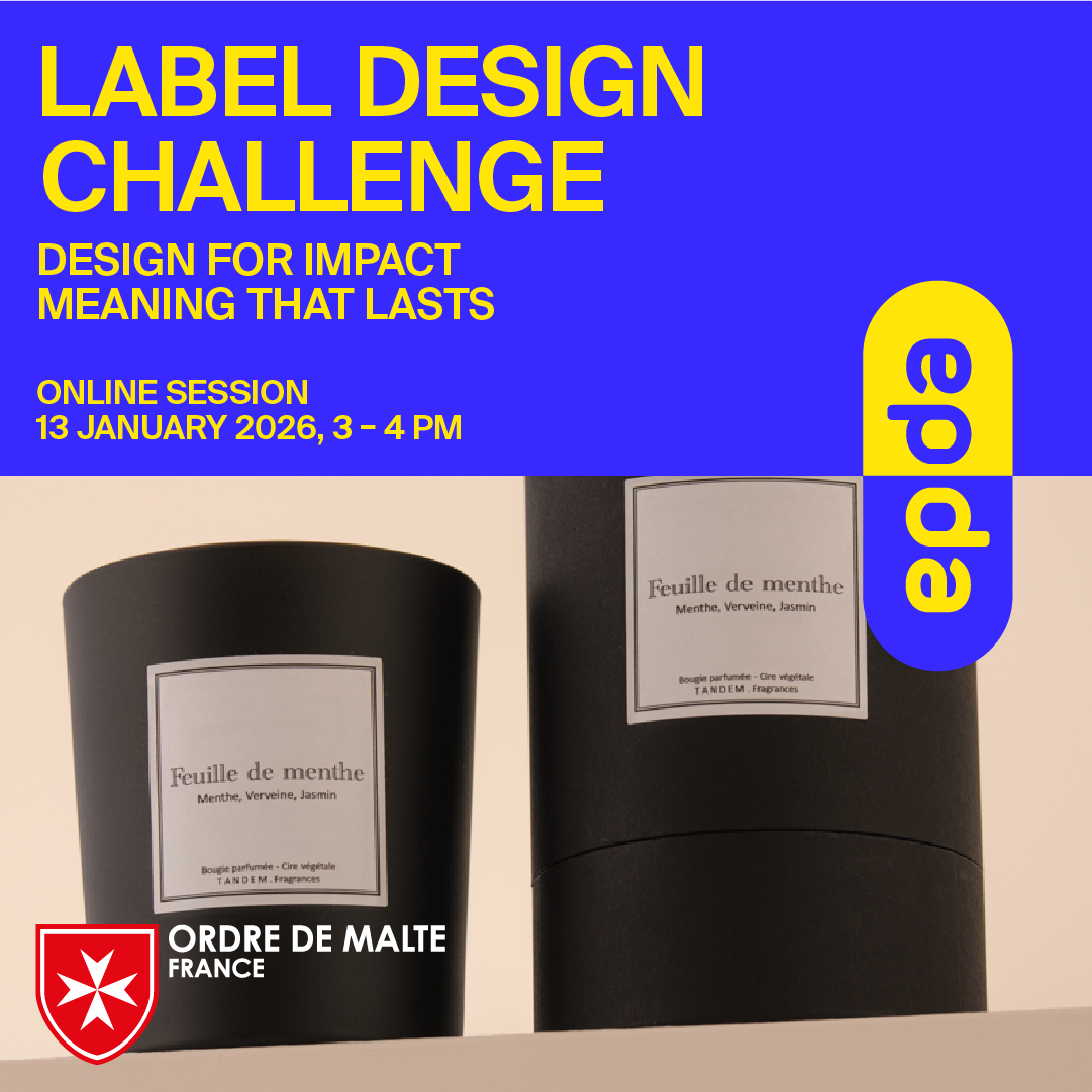
Label Design Challenge: Calling for entries
We’re excited to invite designers from across Europe and beyond to take part in a unique creative challenge: Design for Impact – Meaning that lasts.
Learn more
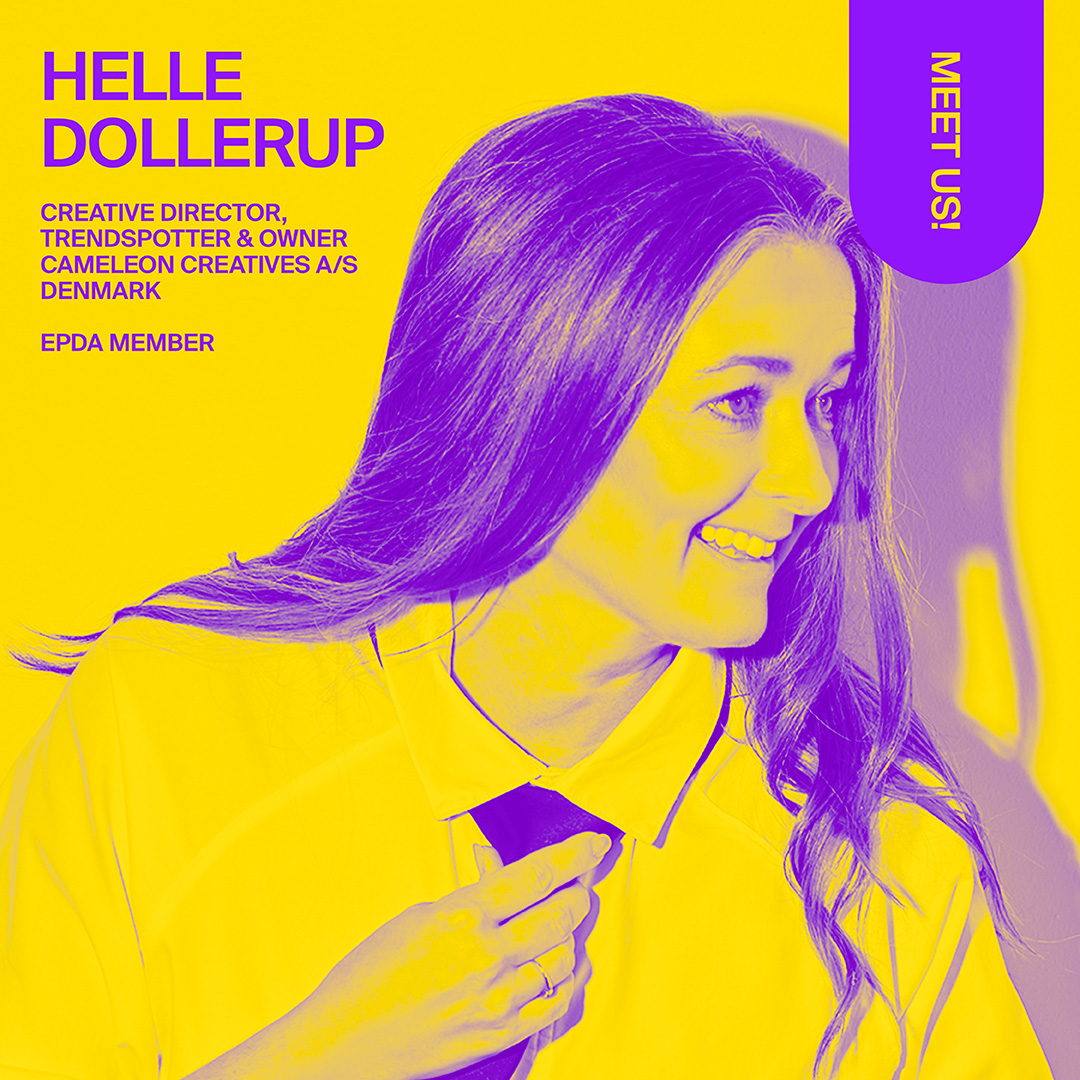
It's all about people: Meet Helle Dollerup
Get to know the Creative Director, Trendspotter and Owner of Cameleon Creatives: In our interview, Helle shares what she has in common with their namesake, the chameleon.
Learn more
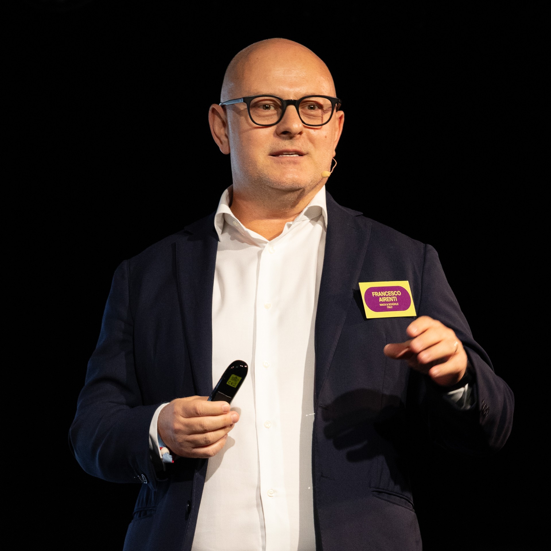
Exclusive pre-launch interview with Francesco Airenti
Prior to the official launch of the GENEVITIS project by MACK & SCHÜHLE Italia, we had the pleasure to lead an interview with Marketing Advisor Francesco Airenti.
Learn more
Colour & Print Solutions by the hubergroup: The Colour GREEN
The Colour GREEN - Chemistry - Design - Human Perception. Insights on the reproduction of Green by Thomas Polster
Learn more
GENEVITIS: When Italian territory, wine, and design become one vision
At the 2025 epda Conference in Porto, we had the honour of discovering GENEVITIS, a pre-launch presentation by MACK & SCHÜHLE Italia that reimagines how wine, territory, and design can collaborate across the entire supply chain.
Learn more
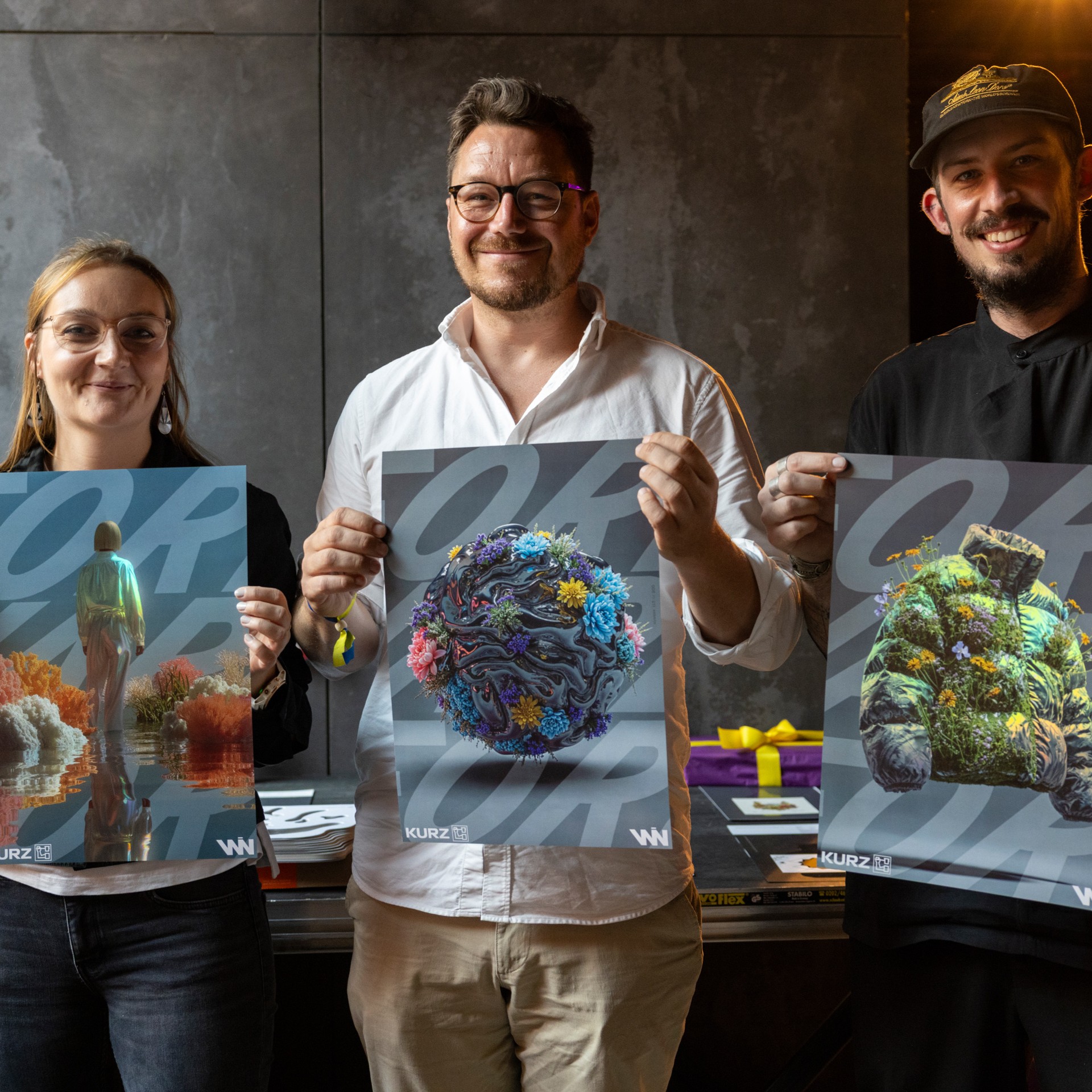
Success is when we all pull together – collaboration along the value chain
At EPDA, collaboration is where innovation begins. This inspiring project, which was first presented at the Forward Festival in Berlin, brings together our industrial partner, KURZ, and our member, WIN Creating Images. It’s a shining example of how creative connections formed within the EPDA community can lead to outstanding real-world outcomes.
Learn more
IKEA pop-up hot streak
Running throughout October, the pop-up focuses on all things food and cooking with visitors able to take part in demos and tastings, shop related products, and even get a new kitchen designed.
Learn more
It's all about people: Guillermo Dufranc
Meet Guillermo, Project Manager and Sustainability Strategist at Tridimage, our member from Argentina. In our interview he is sharing his vision of responsible creativity, his approach to sustainable design, and a childhood memory that seemed to have shaped his career.
Learn more
Come and join us for our Spring Conference 2026
How deliberate thinking fuels work that remains creative, meaningful, and culturally responsible - even under rapid production cycles.
Learn more
Invisible packaging watermarks offer recycling insights
Polytag's invisible UV watermarks can be read by material recovery facilities giving real-time, item-specific insights into where and when the packaging is recycled.
Learn more
What you need to know about the new EU Packaging and Packaging Waste Regulation
The new PPWR aims to reduce the amount of packaging waste, make packaging more sustainable, and increase the amount of packaging that gets recycled in a consistent way across the EU.
Learn more
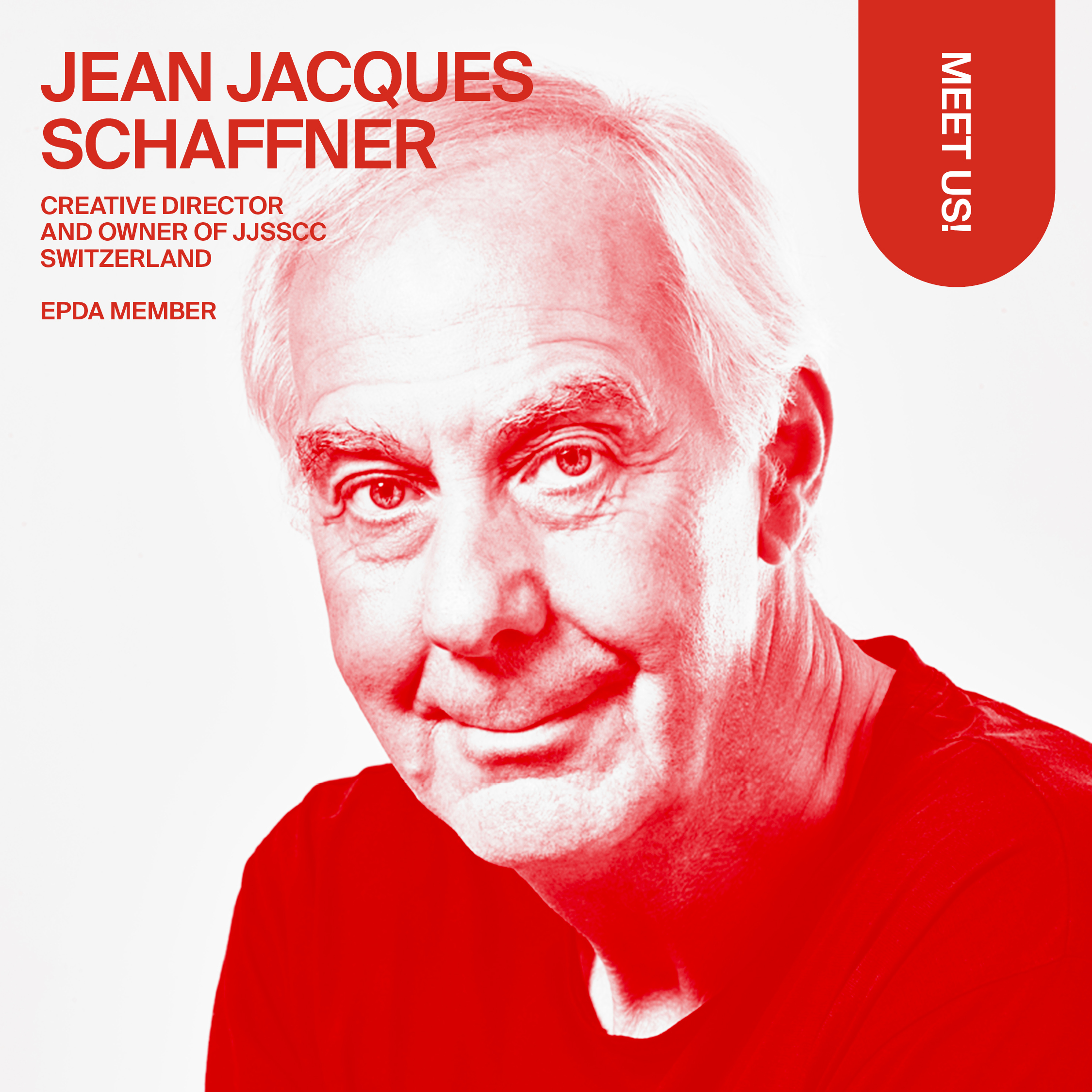
It's all about people: Jean Jacques Schaffner
Meet Jean Jacques Schaffner, one of our founding members! Creative Director and Owner of jjsscc, Jean Jacques was there when EPDA first came to life — at a time when the design world was in real need of cross-cultural exchange.
Learn more
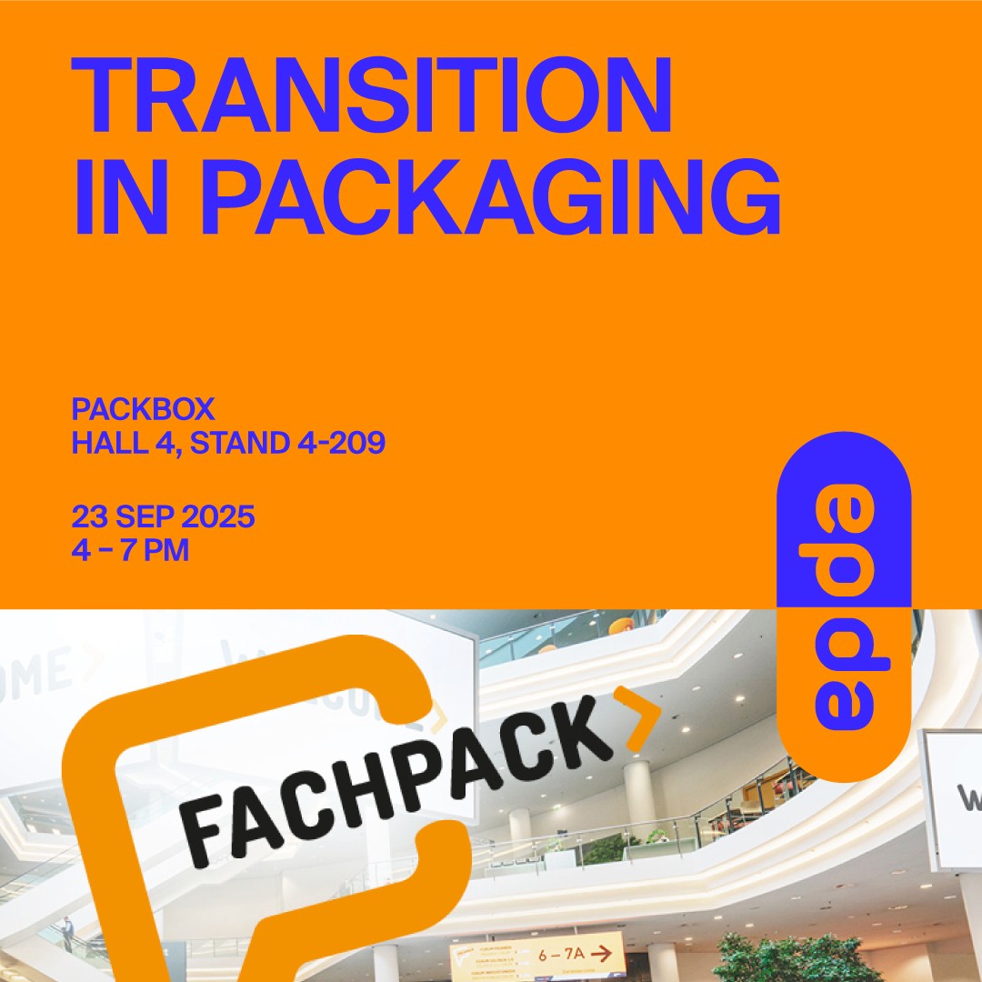
7 October: Webinar "Design that delivers"
Ready to lead the way in circular packaging? Join us for an exclusive webinar with our industrial partner Stora Enso.
Learn more
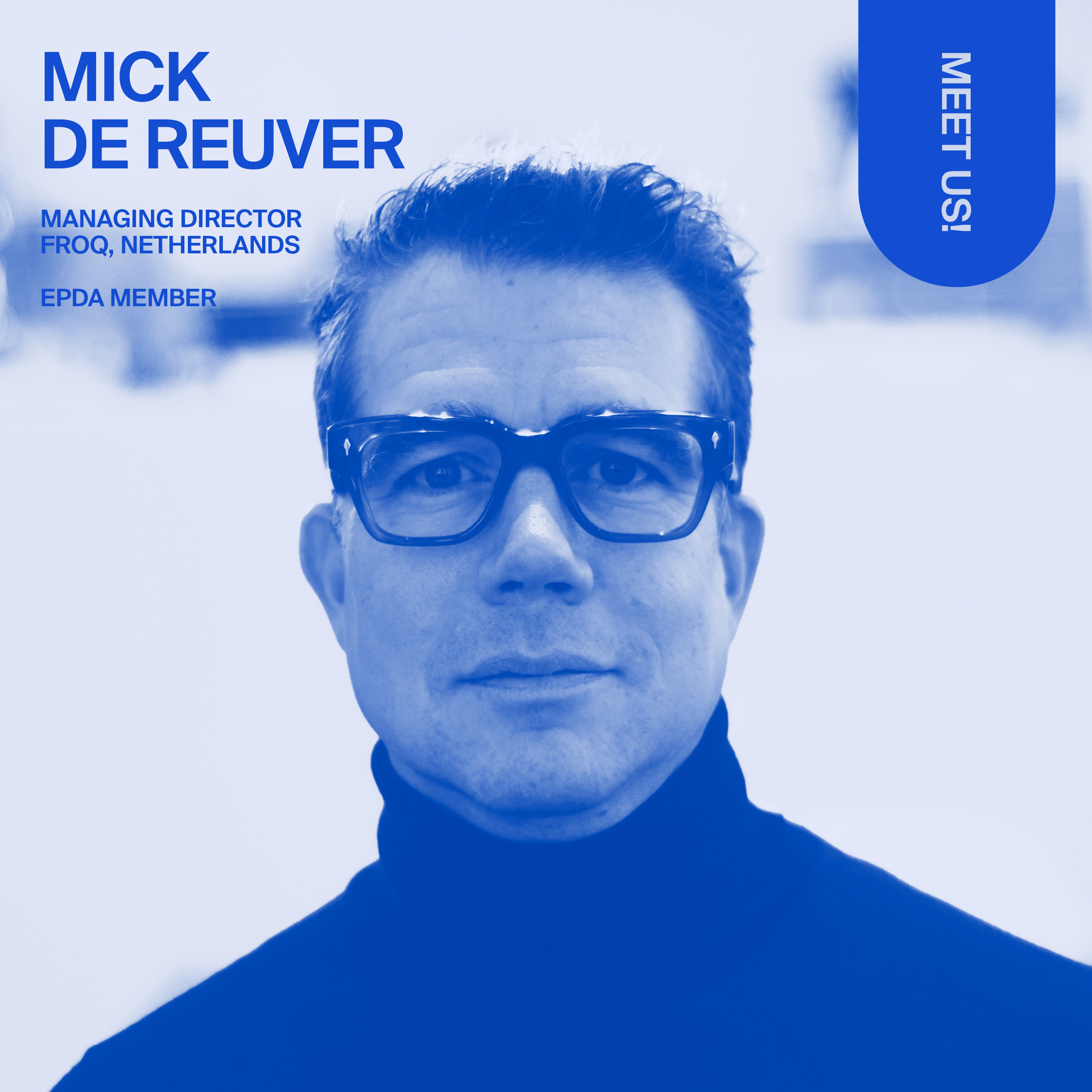
It's all about people: Mick de Reuver
Managing Director at FroQ brandservices today, Mick looks back at a 16-year design agency career, and perfectly knows what it means to connect the two worlds of design & print.
Learn more
Purposeful Transformation: Creating Value Through Inclusive and Smart Design
What if packaging could do more than just protect a product? In this session, epda experts show how smart packaging - powered by 2D codes, AI, and inclusive design - can unlock supply chain transparency, enhance consumer engagement, and create meaningful, accessible experiences for all.
Learn more
How Packaging Designers Can Utilize Adobe Express to Streamline Creativity and Collaboration
Learn more about Adobe Express, a cloud-based, web and mobile-friendly platform designed to simplify the creation of branded visual content
Learn more
Colour & Print Solutions by the hubergroup: The colour BLACK
Carbon-Free Black Printing Inks – A Milestone for Sustainable Print Products?
Learn more
It's all about people: Anastasia Marx
Meet designer Anastasia Marx. Together with her partner Johanna Klüsener she leads Studio Ajot.
Learn more
The Intelligent Pack: Unlocking the Potential of 2D Codes in Packaging
The new 2D code is coming—and it’s set to unlock endless possibilities for connecting packaging with digital content.
Learn more
tesa - EPDA workshop, 22 May 2025
Exploring Innovation with tesa
Learn more
News from the epda Board Team: Welcome Bea
Exciting news: Bea, Founder & Head of Strategy at Estudio Maba has joined the epda Board
Learn more
It's all about people: Ariane Van Mancius
Back from her first EPDA event, Ariane is sharing her impressions with us
Learn more
9 Times MSCHF Made Us Think About Branding
It’s hard to call anything unique in today’s world. But if anyone can make the claim, it’s MSCHF.
Learn more
Get your copy!
The printed edition of the epda FAIR PITCHES ONLY booklet is now available!
Learn more
epda Spring Conference: Back from Hamburg
WHAT A FLOW OF INSPIRATION!
Learn more
epda autumn Conference: SANDEMAN
Meet George Sandeman: Founder & CEO of EX AMPULLA, and representative of the 7th generation of the legendary Sandeman family. With over 40 years of international experience in brand strategy, marketing, and public affairs, George brings unique insights into the power of consistency in brand development.
Learn more
Hands On Event, 24&25 June 25
Discover the future of embellishment & packaging in an exclusive workshop at KURZ Paris
Learn more
ATTEND THE RETHINKING MATERIALS SUMMIT, 14 - 15 May, London
Rethinking Materials is a global event that connects scalable solutions with commercial partners, including top CPG brands, investors, and materials producers.
Learn more
It's all about people: Patrick De Grande
What do Design, Dadaism and Dishwasher Tetris have in common?
Learn more
How can we design better experiences for all?
Inclusive Design topic at upcoming epda Conference in Hamburg, 23 May 2025
Learn more
What M&S’ New Packaging Says About Transparency
The grocery product launch that’s made the biggest impact so far this year is simple – in every way.
Learn more
We are proud to have a new and first member from Lithuania.
Welcome to Juozas Baranauskas and his team from PinProof, Lithuania.
Learn more
It's all about people: Paul Valentiner
Meet Paul Valentiner, CEO & Creative Director at epda member echd.
Learn more
Conference Chair: Soraya Kühne
Join us at the next conference: The Rhythm of the Flow, Hamburg, 23 May 2025
Learn more
Colour & Print Solutions by hubergroup: The colour YELLOW
In this edition, hubergroup's Global Key Account Manager Thomas Polster provides us with insights on the use of the colour YELLOW.
Learn more
Should brands hold fire before posting their take on the latest social media trends?
In a fast-moving digital landscape, trend-driven content can boost visibility - but it also carries risks.
Learn more
Pentawards 2025: Early Bird Entries Now Open!
Save €100 on your submission!
Learn more
It's all about people: Shayna Brown
Meet Shayna Brown, a talented designer specializing in premium packaging
Learn more
Sparkling ideas for 2025
Kicking off 2025 with sparkling ideas at the board meeting in Paris
Learn more
Colour & Print Solutions by hubergroup: PANTONE 17-230
We're delighted to announce a brand new section on our website, created in collaboration with our industry partner hubergroup.
Learn more
Pentawards Festival, 28-29 January 2025
Join this key industry event and meet epda in the festival area
Learn more
10 Brand and Packaging Trends from Japan
Retail insights are often overly focused on what’s happening in the West – to everyone’s detriment. Here are the 10 biggest brand and packaging trends in Japan spotted by Insider Trends, based on in-person experiences
Learn more
Happy New Year from epda
Learn more
CONFERENCE, 23 MAY 2025
We extend a warm invitation to all creatives to follow us to Hamburg, Germany.
Learn more
DANA: People in need. We can do something.
ADCV, the Association of Designers in Valencia, is looking for ideas and initiatives to help people in the areas affected by DANA to support
Learn more
It's all about people: Rob Vermeulen
We're excited to introduce Rob Vermeulen, VERMEULEN DESIGN, Netherlands, and EPDA Board Member: Design School Contact.
Learn more
It's all about people: Sylvia Vitale Rotta
Here is a little interview with our President, Sylvia Vitale Rotta, CEO and Founder of TEAM CRÉATIF GROUP, France. Sylvia is a visionary leader in the design world, known for her philosophy of "designing beautiful tomorrows".
Learn more
It's all about people: Mii Plock
Mii hasn't attended an epda international event yet - so let us introduce you to her this way. What a great personality she is!
Learn more
Unilever Pilot Turns Unwanted Flowers into Fragrances
Unilever - together with the University of Nottingham and Bridge Farm Group - is trialling turning unwanted flowers into fragrances for its products.
Learn more
It's all about people: Anna Defez
We continue our new "MEET US" section where we introduce you to the passionate people behind our association. Today, an interview with Anna Defez, a passionate designer from Spain now based in Germany, and our Comms Support Manager.
Learn more
Why Fashion Brands Aren’t the Only Ones Capitalising on Fashion Week
It’s Fashion Week season. From Berlin, Milan and Paris to London and New York, the world’s biggest fashion brands are all congregating in some of the world’s biggest fashion cities to showcase their latest collections.
Learn more
epda has partnered with STGU
We warmly welcome Polish Graphic Designers to the upcoming epda Conference in Warsaw
Learn more
'Designing with purpose' takes center stage
Hernán Braberman, Executive Creative Director & Co-Founder at epda member Tridimage, shares insights as Pentawards Jury Member 2024
Learn more
Emerging and established trends in brand & packaging design
Jane Struk, Creative Director at epda member ARD Design, shares insights as Pentawards Jury Member 2024
Learn more
It's all about People: Vincent Guignard
We believe in exchange. Get to know epda people!
Learn more
Starbucks’ Community Stores
Starbucks’ Community Stores Show Importance of Localisation
Learn more
Nostalgia is the Growing Brand Trend
Nostalgia is going strong as more and more brands look to tap into the power of customer emotions.
Learn more
Diageo Taps Gen AI for Personalised Packaging
Throughout August, visitors to Diageo’s Johnnie Walker Princes Street venue in Edinburgh, Scotland, can create their own personalised bottle of Johnnie Walker Blue Label.
Learn more
10 Inspirational Community-Focused Brands
Get inspired by 10 inspirational community-focused brands who run the spectrum from start-up to big name to cult favourite.
Learn more
NABA Students show industry collaborations at drupa, Düsseldorf
3 projects between key packaging & print industry leaders and NABA students were showcased at drupa touchpoint packaging 2024
Learn more
epda AWARD FUTURE PACKAGING: 1st prize 2024 - Zuyd Hogeschool Maastricht
Interview with Sanne Heijnen, who won 1st place in the epda Future Packaging Award x Zuyd University Maastricht with her project Ryzco.
Learn more
epda AWARD FUTURE PACKAGING: 1st Prize 2023/2024 - NABA
Interview with Pietro Cosimo Capellini and Rebecca Casati, 2 of 3 NABA Nuova Accademia di Belle Arti students who worked as team to create their award-winning entry to the epda Award Future Packaging 2023 / 2024.
Learn more
Pop Up Grocer’s Discovery Model Rewards Packaging That Stands Out
A new approach to grocery retail shines adifferent light on branding.
Learn more
"Designers, the industry needs you"
The Connected Experience Report (vol. 2) by Sharpend is out! It reveals interesting insights about why the industry needs us designers to enter a new age beyond packaging.
Learn more
Fair Pack for Fair Brands: Winners of Faculty of Fine Arts, Warsaw
Learn more
Student teams of Faculty of Fine Arts, Warsaw, participated in the epda Award
Learn more
epda Award Future Packaging!
With a different brief every year we ask to create packaging & brand design that meet the needs of future generations at the same time considering the protection of the environment.
Learn more


.png)


.png)


.avif)
.avif)
.avif)
.jpg)


