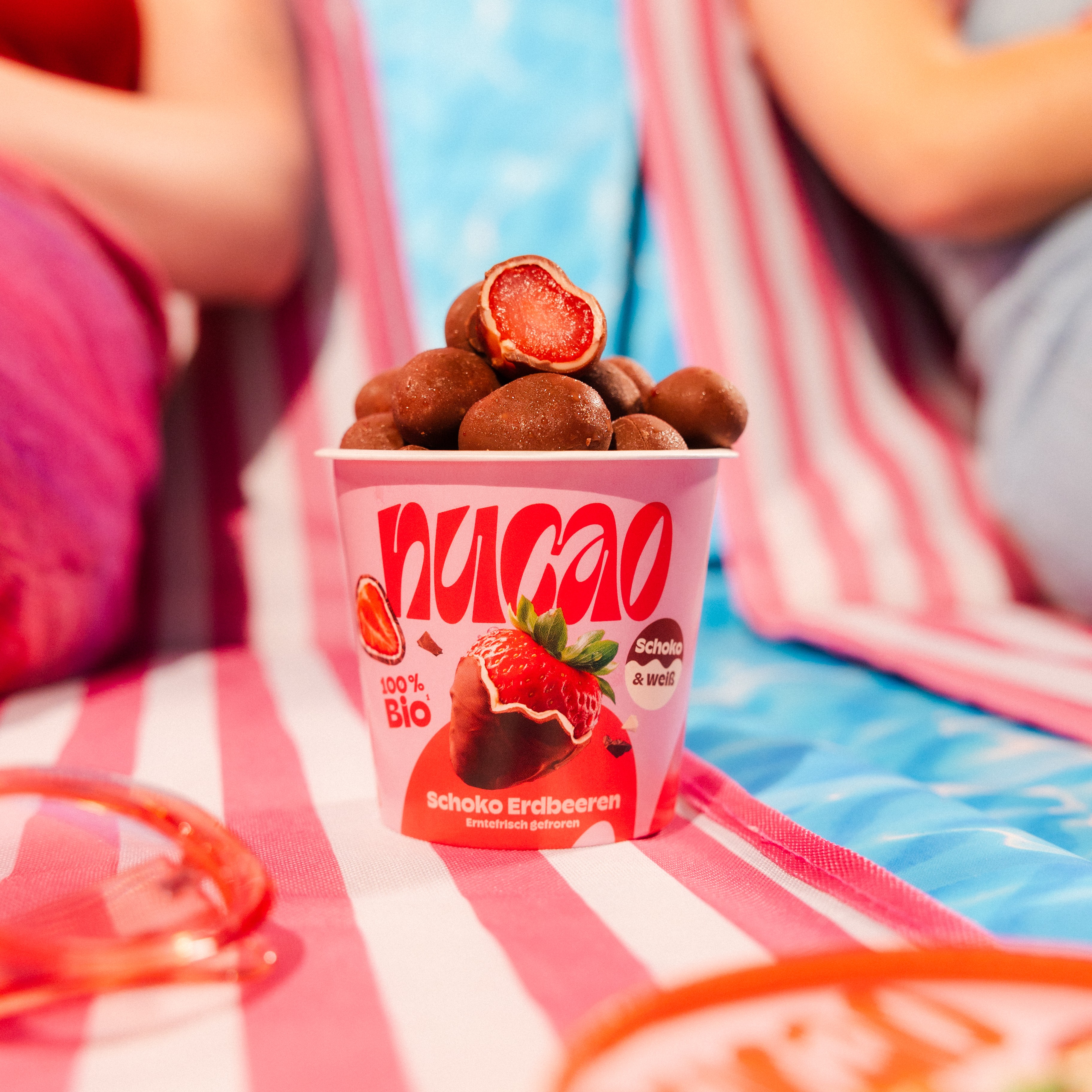
10 inspirational uses of typography in packaging
The important role typography plays in packaging can’t be underestimated. With a limited amount of space available, every word on a piece of packaging has to count when it comes to communicating with customers. This communication isn’t just about the choice of words though. Typographical choices from typeface and font to size, shape, colour and position all have an impact on the effectiveness of the packaging. Typography can also suggest a lot about the brand behind the product. For example, at a time when the world has struggled with uncertainty caused by the coronavirus pandemic, many brands have looked to soften their typography to present themselves as a friend to the customer. Typography that evokes nostalgia or feels retro is on the up, alongside gentler and curvier typeface choices that feel comforting to the customer. Here are 10 inspirational examples of brands using typography to great effect in their packaging designs.
- Burger King
Burger King is among the most recognisable brands in the world. It decided to play on its heritage in its most recent redesign with a retro-feel approach. At the heart of the rebrand is typography that draws inspiration from Burger King’s original branding and the psychedelic associations of the 1960s and 70s. The typeface is rounded, stretched and wavey. The letters vary in size which creates a sense of movement. The overall effect is one of nostalgia at a time when everyone is thinking back to how things used to be.

- McDonald’s
Not to be outdone, fast food rival McDonald’s has also overhauled its packaging with a new look and feel. Designed by agency Pearlfisher, the new designs are simple but effective using flat illustrations to evoke McDonald’s different products. Unlike Burger King, the McDonald’s redesign uses typography in a minimal way. The type is small in size but eye-catching as a result of the white space around it. The rounded letters are modern but also feel familiar making the redesign comforting rather than alienating.

- Harry’s
Shaving brand Harry’s opted to do something very different with its typography for its limited edition Shave With Pride kits. The brand’s normal branding and typography has a sleek, modern look to it. For the Shave With Pride kits, which sees a donation made to LGBTQ+ charities for every kit sold, Harry’s partnered with artist Zipeng Zhu to create a different approach. In keeping with his own work, Zhu has created a typographical identity that is fun and experimental. Bright block colour backgrounds mean the bold black lines of the type instantly catch the eye. A mix of slanted and straight letters, and thicker and thin lines add further expression to the design.

- Nuud
Nuud is a new plastic-free, biodegradable chewing gum brand.As a company doing something different in an established sector, Nuud’s packaging needs to reflect that by combining a unique look with familiar customer prompts, such as colour. The brand worked with agency Mother Design to do exactly that. The typography is key with the Nuud logo bringing to mind a white toothed smile. There is a retro quality to the rounded letters of the typeface which is reminiscent of the 1960s. The typography enables Nuud to communicate its important messaging in a fun way that attracts the customer rather than overwhelming them.

- Plus
Another new brand shaking up an established sector is Plus. Plus is a zero waste personal care brand that has created a shower gel concept with dissolvable packaging. Customers take the sachet of body wash into the shower, open it to remove the body wash sheet, and then drop the sachet on the floor to dissolve while they clean themselves. In keeping with the no frills packaging concept, the design is also no frills focusing entirely on typography. The bold lettering of the logo is the biggest component on the packaging to draw the eye and cement the branding. The type is all uppercase with a mix of round shapes and hard lines that make it easy to read the information being presented. Block colour backgrounds help differentiate the fragrance of the body wash and add interest.

- Plenty
Indoor vertical farming company Plenty has taken cues from the fast food world for its unusual salad packaging. The red, yellow and purple colour scheme evokes some of the biggest fast food brands in the world, which helps to draw customers in through familiarity. It also distinguishes Plenty from others in the packaged salad category. The typography continues the fast food association. The curves and points of the type make the packaging seem enticing and appealing. The rounded block letters are suggestive of time periods like the 1960s and 70s, which helps the brand to feel more established than it is.

- Dr Bronner’s
Soap and personal care company Dr Bronner’s takes a different approach to most with its typography. Rather than keeping information to a minimum so it’s easy to read, the labels on Dr Bronner’s products are almost nothing but text. In order to fit it all in, the type is small meaning that customers have to pick up and look closely at the bottle to read anything other than the product name. However, the typographical approach is effective in setting Dr Bronner’s apart from other products on the shelf. It also creates a feeling of authenticity and authority which is important given that the brand started in 1858.

- Miels d’Anicet
Recently, Canadian honey company Miels d’Anicet celebrated its 20th anniversary. To mark the occasion, the company created a special edition honey. It also took the opportunity to communicate what is special about its products with a limited edition jar design. The label was replaced with handwritten text in French communicating Miels d’Anicet’s passion for honey. The use of handwriting conveys a feeling of authenticity and care by bringing to mind home-made preserves with individually written labels. It is complemented by an exterior box that uses a classic serif font to communicate that this is a premium product.

- Mayawell
Mayawell is an unusual addition to the soft drink market. Its sodas contain prebiotics that are designed to improve digestion and boost gut health. The brand had turned to typography to communicate this difference in its packaging. Rather than making a feature out of the brand name, Mayawell literally spells out exactly what the product is right on the front of the can. The benefits that the product can offer are also written directly on the can using colour to catch the eye. The typeface is modern and friendly in keeping with the new approach of the product.

- Gerry’s
Alcohol-infused or ‘hard’ seltzer drinks are a fast growing product category. New Zealand-UK brand Gerry’s is one of a number of new names within the sector. Despite this, the company feels well established thanks to the typography of its logo. The swirly, curved letters appear to be inspired by the typefaces of the 1960s and 70s. The packaging design is minimal using pastel block colours as a backdrop for the prominent logo. The other type on the can is smaller in size and uses straight lines and upper case to juxtapose the main Gerry’s logo. It’s an eye-catching combination that uses the logo to draw in customers who are curious about what the product actually is. This is a smart tactic at a time when many people may not be familiar with hard seltzers and therefore not actively looking for them.

By Cate Trotter, Head of Trends at retail futures consultancy Insider Trends.