Baries design


Baries design is an agency for strategic design based in Düsseldorf, Germany. Since 2009 our expertise is packaging design and our strategically thinking team makes us willing to go the extra mile for visionary brand building. Ever since, we have been designing consumer goods for the cosmetic-, care-, food and non-food industry for national and international customers and are always ready to explore new challenges.
As an owner-managed agency, we take care of the complete design development process from consulting to execution. With our holistic approach we follow an iterative process including meaningful interactions between briefing, analysis, concept and design. This allows us to create strategic value for national or international brands whilst providing complete transparency. baries design consists of a team of enthusiasts from product-, graphic-, industrial- and communication design mixed with marketing and project management. Our shared passion for design & innovation radiates through everything we do.
Our heart does not only beat for design. It is our heart’s desire to have a special focus on the social & environmental impact we have as an agency.


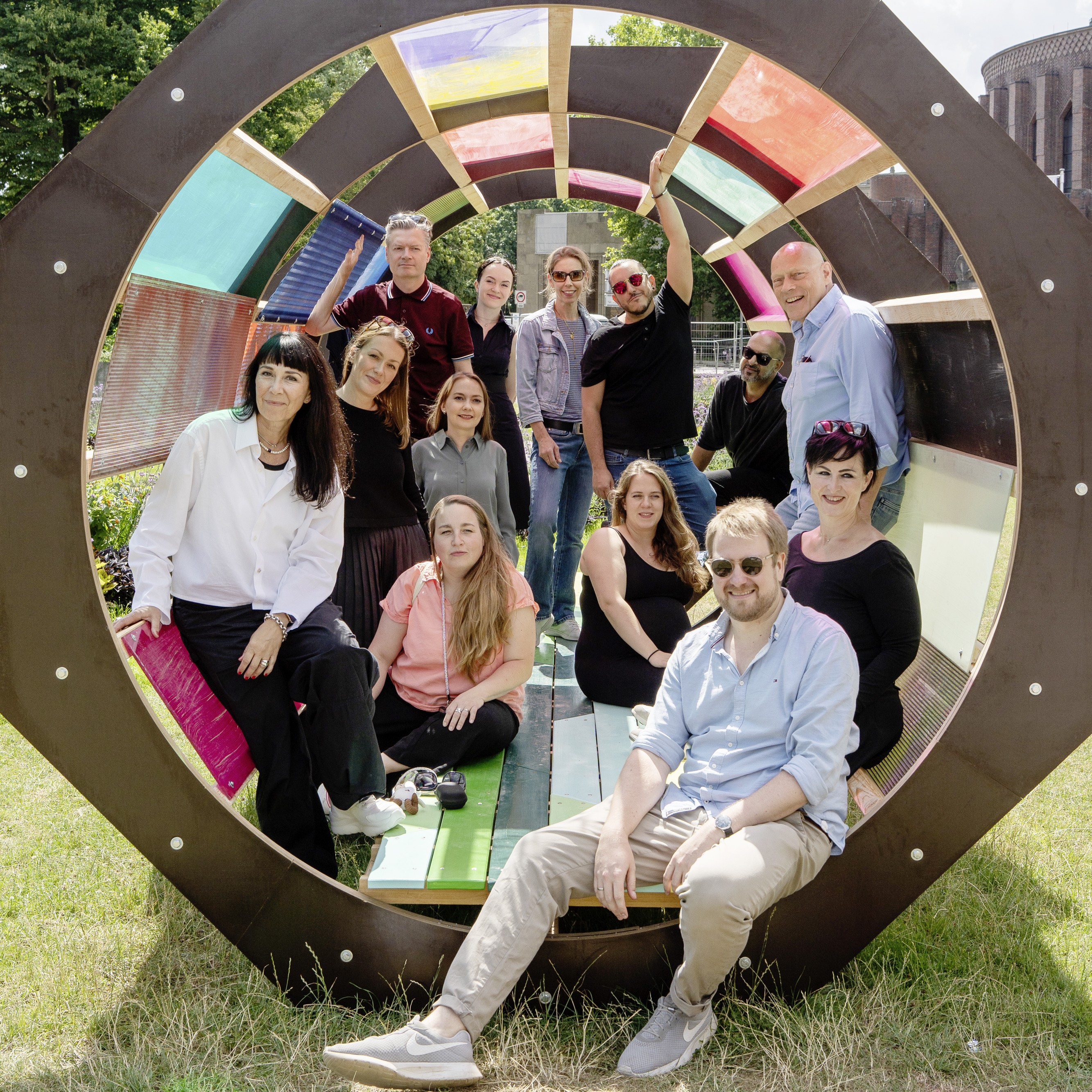
"EPDA is a community where we can share, dare and shine together with all other agencies. We communicate at eye level and enrich each other with knowledge and get good new approaches to think and to break new ground."
Cases
Weleda Booster Drops: Clean, bold & Gen Z


baries design developed a clean, vibrant packaging design for the Weleda Booster Drops that appeals to Gen Z consumers. It reinterprets the brand’s roots in a contemporary way — highly visible on the shelf and impactful across social media.
INITIAL SITUATION / CHALLENGE
With its new Booster Drops, Weleda aims to specifically target Gen Z consumers while simultaneously communicating its anthroposophical heritage. baries design was tasked with creating a packaging design that makes this brand shift visible: clean, modern, and clearly rooted in the Weleda universe. The challenge was to reinterpret the brand’s anthroposophical roots in a contemporary way and create a design that resonates with young women and men both visually and emotionally.
SOLUTION / STRATEGY
baries design’s approach brings the Booster Drops to the shelf — and into Gen Z feeds — in a clean, bold, colorful, and unmistakably “Weleda” style. The packaging relies on strong color contrasts and a centrally placed droplet as the key visual element. A special foil finish highlights the droplet with striking effect and conveys the product’s premium character. The well-known Weleda logo remains clearly visible, reinforcing brand recognition.
DESIGN PROCESS
The design process was shaped by close, fast, and highly effective collaboration with the client, Weleda. At the beginning, the design team focused on understanding Weleda’s objectives, the competitive landscape, and the target audience — namely young women and men from Gen Z.
RESULT / SUCCESS
The result is a packaging design for the Weleda Booster Drops range that successfully marks the shift toward a Gen Z–ready clean beauty line while translating the brand’s anthroposophical roots for the next generation. “Drop it! Mix it! Boost it!” — the claim also developed by baries design for the new Weleda hero range — captures the concept in a concise and memorable way.
Syoss Oleo Relaunch: Rich. Nourishing. Premium
baries design created the Syoss Oleo relaunch, aimed at women between 25 and 50 years old, combining care, quality, and color intensity in a powerful design. Visible on the shelf. Clear in its positioning.
INITIAL SITUATION / CHALLENGE
Women looking to cover their first gray hairs or seeking a nourishing hair color expect more than just color. They want protection and a premium feel in one product. The task was to create a relaunch that communicates exactly that — clearly differentiated from the baseline range while remaining firmly anchored in the brand world. The gold color code was non-negotiable. It is the range’s distinctive visual signature and had to be preserved and strengthened in all its variations.
SOLUTION / STRATEGY
baries design reimagined the oil droplet as the central symbol of the Oleo range. The result is an oil droplet that instantly conveys premium quality, visually represents the rich formula, and tangibly communicates the nourishing color cream. Various finishing techniques were explored and evaluated in order to perfectly align the interaction of material, haptics, and appearance with the oil droplet. Because premium quality should not only be seen — it should be felt. Together with the client, the team ultimately chose the TRUSTSEAL® SFX process and hot foil stamping by KURZ.
DESIGN PROCESS
Strategic. Iterative. Close to the product.
The design process began with an in-depth analysis of the target audience and the competitive landscape. Women between 25 and 50 want a hair color they can trust. The design needed to communicate that trust at first glance. Exploring printing techniques and material surfaces was a key part of the process, as design and production were considered together from the very beginning.
RESULT / SUCCESS
The result is a packaging relaunch that repositions the Oleo range: premium, nourishing, and clearly differentiated from the baseline line. The redesigned oil droplet gives the range a distinctive identity, while the gold color code ensures strong shelf recognition. A design that appeals to women who do not see color and care as opposites, but as a natural combination.
“Feel Good”: Packaging design for a new Dr. Oetker mug pudding range
baries developed the packaging design for Dr. Oetker’s “Feel Good” mug pudding range. With playful lightness, the design communicates the product promise of “indulgence without added sugar.” It primarily appeals to a younger target audience, creates strong shelf impact, and remains instantly recognizable as a Dr. Oetker product.
INITIAL SITUATION / CHALLENGE
The task for the packaging design was to present the promise of “indulgence without added sugar” in a contemporary way while staying true to the Dr. Oetker brand. The “Feel Good” mug puddings in the flavors vanilla, chocolate, and semolina were meant to visually reference already familiar Dr. Oetker products while still conveying a sense of novelty. Consumers should immediately recognize them as Dr. Oetker products while also understanding the new concept of “indulgence without added sugar.”
SOLUTION / STRATEGY
The baries team developed a design concept that explored different approaches to typography, colors, and layouts in order to optimally address the needs of the target audience. The packaging design was created to communicate indulgence without added sugar in a contemporary way while integrating Dr. Oetker’s familiar brand elements. Through elements such as clouds, typography, and contrast, the design conveys a sense of lightness that blends seamlessly into the established Dr. Oetker branding.
By closely aligning the design with already successful products from the brand, a strong connection to Dr. Oetker was achieved, ensuring attention from the younger target audience on supermarket shelves. The goal was to preserve the brand identity while simultaneously introducing something new.
DESIGN PROCESS
From the very beginning, the design process followed an iterative approach: the baries design team developed several design directions that presented the key communication requirements of the new range in different ways. This included testing various typography and color options to maximize shelf impact and appeal to the target audience.
RESULT / SUCCESS
The result was a packaging design created by baries design for Dr. Oetker that successfully meets the requirements of a new mug pudding range aimed at a younger audience. Familiar Dr. Oetker brand elements were combined with new design features — ensuring both strong shelf impact and brand continuity.