Colour & Print Solutions by the hubergroup: The Colour GREEN
This series is designed to help designers and printers tackle the complexities of colour reproduction and achieve outstanding results. In this edition, hubergroup's Global Key Account Manager Thomas Polster provides us with insights on the use of the colour GREEN.
The Colour GREEN - Chemistry - Design - Human Perception
"Green is more than just a colour — it’s a fascinating intersection of chemistry, visual communication, and psychology" says Thomas Polster, Key Account Manager, epda Industry Partner hubergroup.
THE CHEMISTRY BEHIND GREEN
Green isn’t a chemical substance itself, but a perceived colour created by light wavelengths between 490–570 nm.
Pigments like chlorophyll reflect this wavelength, giving plants their iconic green appearance. Other well-known pigments include chromium oxide green, Veronese green, and organic dyes such as malachite green. In the printing industry, 99.9% of the pigment used is PG 7 green. In contrast to the wider selection of yellow and red pigments, the variety is limited, but this can also make a brand colour more stable—in other words, there are fewer opportunities to use different formulations for a brand colour. Sometimes less is more.
Key Properties of Pigment Green 7
• Colour Shade: Bluish-green with high chroma and brightness. Look at PANTONE GreenC
• Lightfastness: Excellent (typically 7–8 on the Blue Wool Scale).
• Weather Resistance: Outstanding, suitable for outdoor and packaging applications.
• Heat Stability: Up to 220–280 °C for short durations, making it compatible with heat-involved processes.
• Chemical Resistance: Resistant to acids, alkalis, and most solvents.
• Dispersibility: Very good in water-based, solvent-based, and UV-curable ink systems.
Applications in Printing Industry
• Offset and Gravure Inks: Commonly used for high-quality packaging and decorative printing.
• Flexographic Inks: Suitable for flexible packaging films.
• UV-Curable Inks: Works well in modern digital and specialty printing.
• Metallic & Laminated Film Inks: Maintains colour integrity on challenging substrates.
Advantages
• High Tinting Strength: Small amounts produce vivid colour, making it cost-effective.
• Non-Toxic & Environmentally Compliant: Meets RoHS and REACH standards; free from heavy metals.
• Long-Term Colour Stability: Ideal for products exposed to light and weather.
GREEN IN ART & GRAPHIC DESIGN
On the colour wheel, green sits between yellow and blue and is considered a secondary colour.
Designers use green to communicate life, freshness, harmony, and nature. But I don´t need to tell you anything about that.
• In RGB, pure green comes from maximizing the green light channel.
• In CMYK, green is created by mixing cyan + yellow, producing a wide range of shades—from lime to olive.
HOW WE PERCEIVE GREEN
The human eye is particularly sensitive to green. Our retinal photoreceptors respond strongly to green wavelengths, which may have evolved to help us recognize vegetation and food sources.
Psychologically, green conveys balance, calm, growth, renewal, and even prosperity. Dark greens feel stable and grounded, while light greens evoke spring and freshness.
Green in the Printing Industry
In print, green plays a major role—especially in branding, packaging, and environmental communication. Green is created by combining the aforementioned green pigment 7, cyan, yellow, and other available pigments. By adjusting their ratios, countless shades of green can be produced.
Applications Across Print Technologies
• Offset printing: High precision for saturated and consistent greens.
• Flexographic printing: Ideal for packaging, especially on plastic, paper, or cardboard.
• Digital printing: Allows fast, flexible adjustment of green tones.
• Screen printing: Perfect for textiles and promotional materials, offering strong, durable greens.
Green in Branding & Marketing
Many brands rely on green to communicate sustainability, health, nature, and freshness—from food packaging to eco-friendly product lines and modern web design.
Challenges With Printing Green
• Colour accuracy can vary across printing processes.
• Light greens may appear less vibrant on matte surfaces.
• Complex designs may require careful colour balancing to avoid clashes.
• Brand colours formulated with Pigment 7 are perceived as stable and robust. This robustness is equally problematic when it comes to building and reproducing these spot colours in CMYK.

Summary
Green is a multifaceted colour shaped by chemistry, artistic practice, and human biology. In printing and design, it symbolizes nature, renewal, and harmony—while offering endless creative possibilities across CMYK processes, branding, and visual communication.
Feel free to get in touch with Thomas Polster with any questions you may have:
Global Key Account Manager & Manager Global Business Development Brand Owner
hubergroup Deutschland GmbH
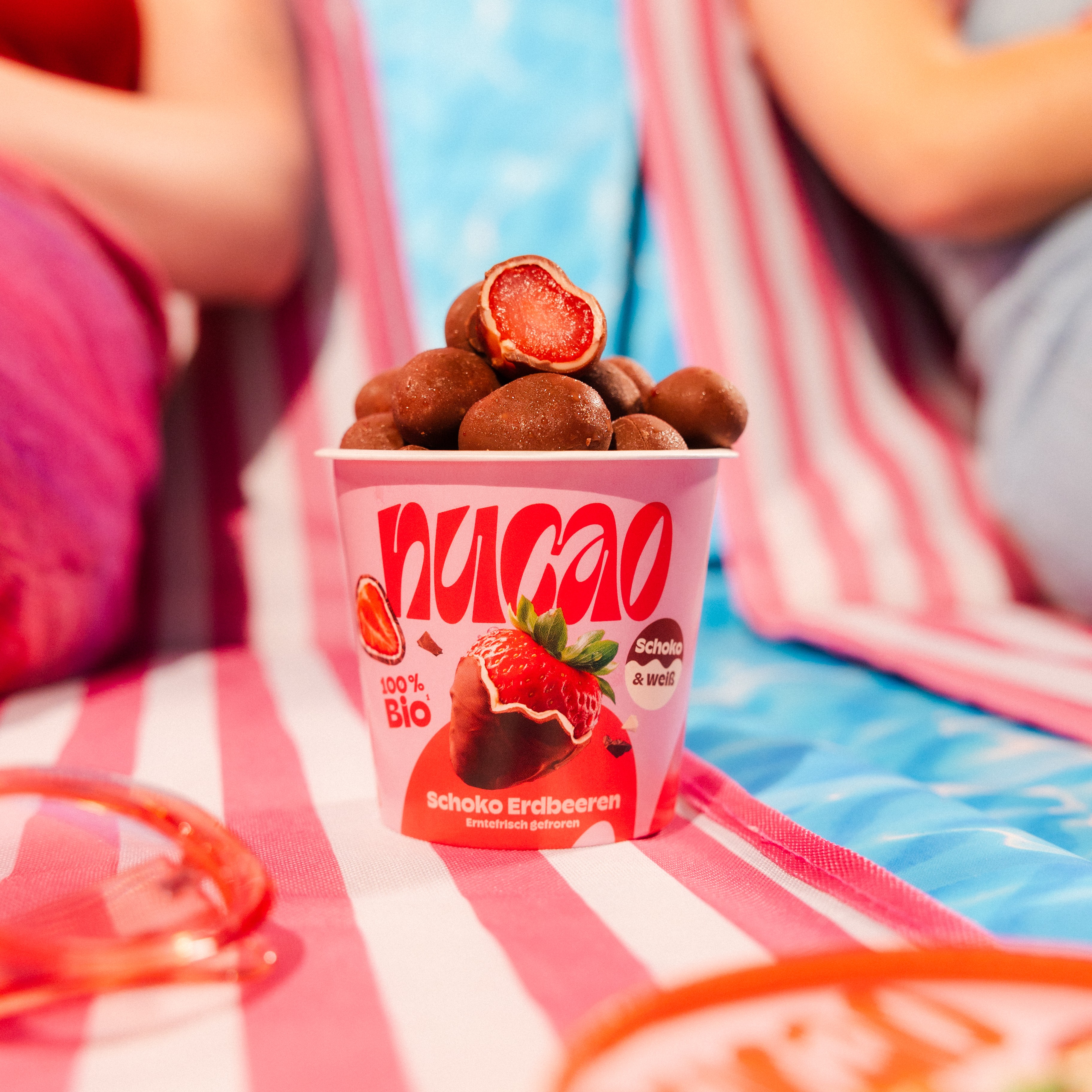
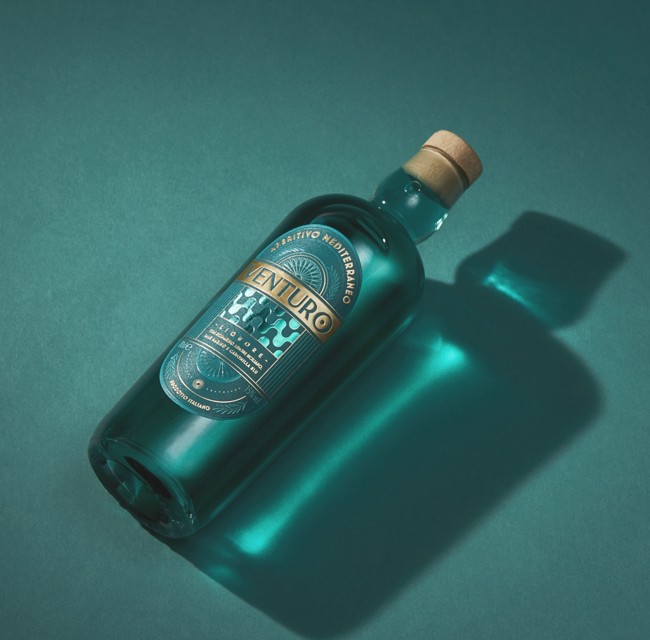
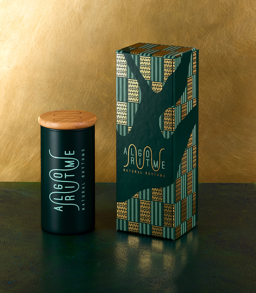
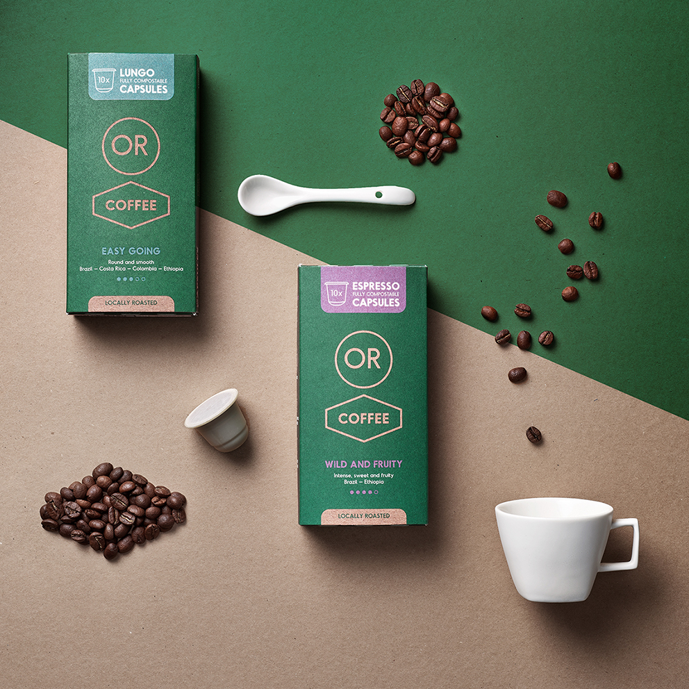
The photos shown have been kindly provided by our member Quatre Mains, who work for these clients.